What’s SVG?
Scalable Vector Graphics (SVG) is an XML-based vector image format for two-dimensional graphics with support for interactivity and animation. The SVG specification is an open standard developed by the World Wide Web Consortium (W3C) since 1999. SVG images and their behaviors are defined in XML text files.
Super fast, super sharp rendering of images inside the browser. Unlike image files (like .jpg, .gif, .png) themselves, SVG is light, loads quickly and adjusts to responsive sizing perfectly. SVG’s XML based schema lends itself to some interesting manipulation for stunning, easy to implement effects.
Libraries like jQuery make for easy to implement, seamlessly timed path animations like this:
Polygon’s Xbox One Review (Via Polygon)
Polygon’s Xbox One review uses embedded SVGs throughout the document – those line drawings are animated by manipulating the <path> properties using jQuery. Super quick, super light, and sharply timed. Obviously there are some wonderful visual presentation elements too – the navigation and typography are quite excellent.
SEO time: Think about how competitive a search term “xbox one review” actually is. Content marketing like Polygon’s unceremoniously eclipses the classic blog post on social buzz, inbound link acquisition and revenue through first touch attribution to the extent that frankly, even “boring” industries need not to ignore thought leadership like this. By the way, Polygon were doing this in late 2013.

And this:

See them here: https://www.polygon.com/a/ps4-review and https://www.polygon.com/a/xbox-one-review
Frozen: The 70-Year Journey to the Silver Screen (Via Bennet.org)
Finishing touches to your visual presentation make *all* the difference, especially for engagement, and that extra wow factor. So when I saw Tom’s (of learn how to build it yourself fame) path animation on the SVGs used to divide sections in his blog post, I knew he was getting included in my examples.

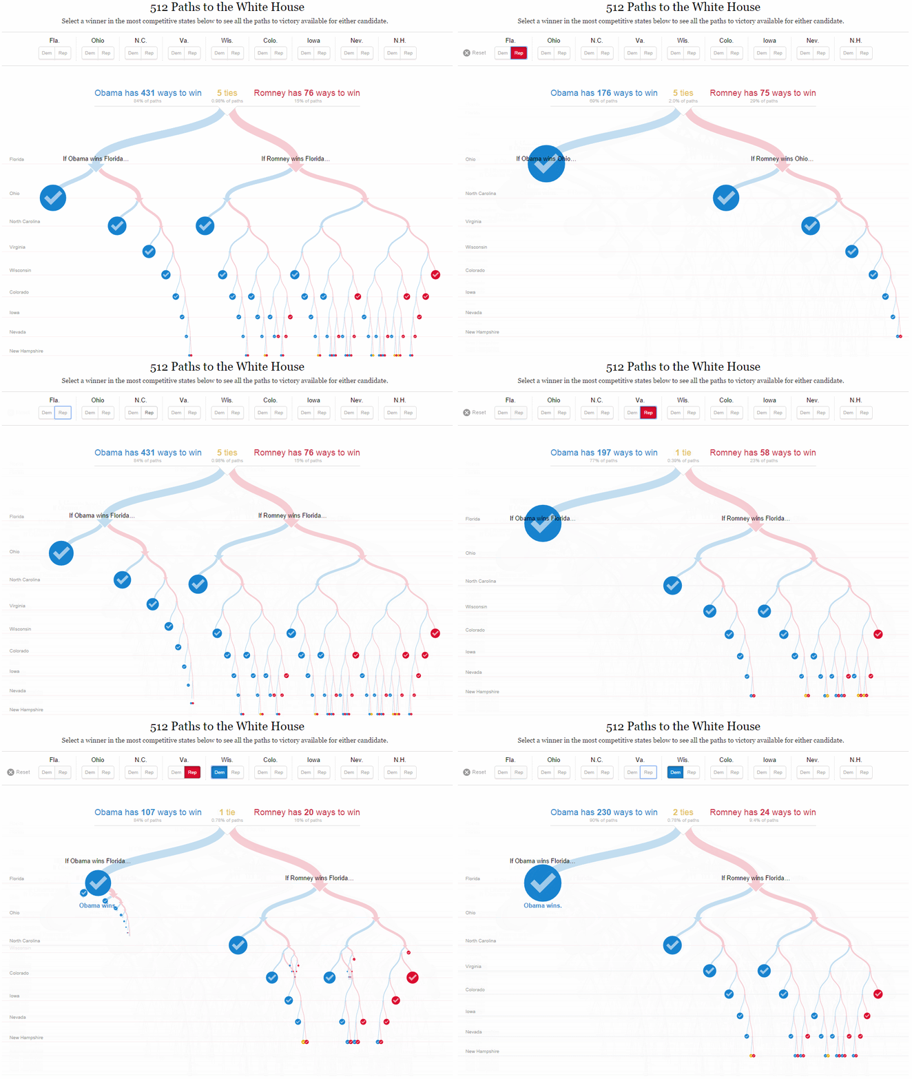
512 Paths to the White House (Via nytimes.com)
512 Paths to the White House is a d3.js powered topical data visualization. Now, it’s from 2012, but as an example, I think it’s still super relevant today. A lot of content marketers see d3.js and immediately think “ah, the library for data visualization!” – well, that’s what it gets used for but D3 is actually an SVG manipulation library – you can do a lot of cool things with it, but you’re more or less developing a custom JS layer to handle the SVG every time.
The development process for 512 Paths to the White House is outlined here. Here it is:

See it here: https://www.nytimes.com/interactive/2012/11/02/us/politics/paths-to-the-white-house.html
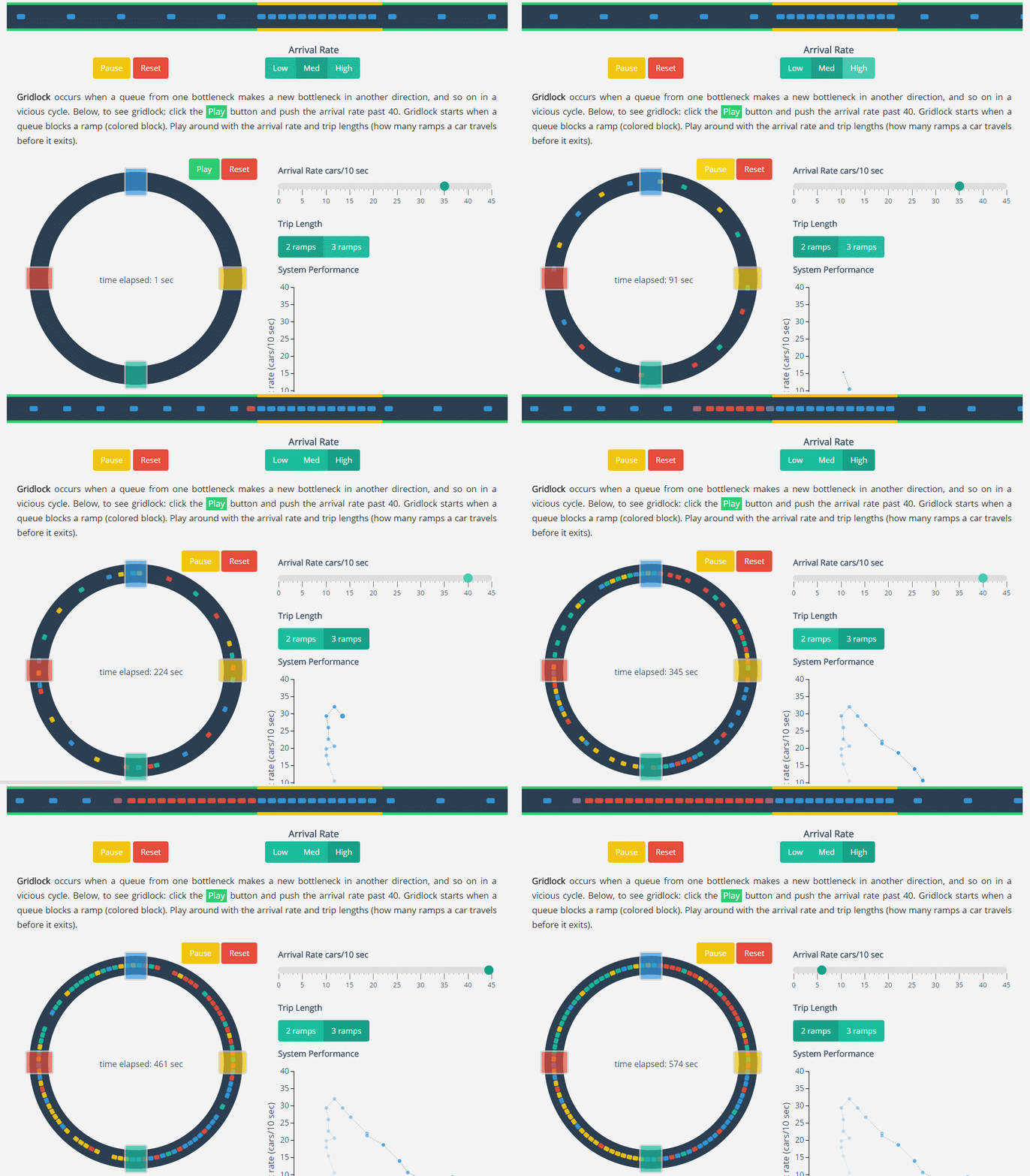
Gridlocks and Bottlenecks (Via https://setosa.io/)
Lewis Lehe’s Gridlocks and Bottlenecks is a custom d3.js, AngularJS based explanation of the surprisingly technical and oft-misunderstood “gridlock” and “bottleneck” terms in road traffic planning.
It’s also very cool:

See it here: https://setosa.io/blog/2014/09/02/gridlock/
Once again, I’m always in awe of what’s possible with some JS, a decent idea and a good development team. Hopefully, these examples are useful, and you might even have some of your own – do feel welcome to share in the comments below. Thank you!
