Step 1: Collect your data
To be able to produce a chart like the example above, you’ll need Microsoft Excel, and a rankings checker that will export rankings data, by search engine and by date. For tracking rankings over time, I’m using Advanced Web Ranking.
Start by putting your data in an Excel table named “rankings” just like this:

Create a pivot chart
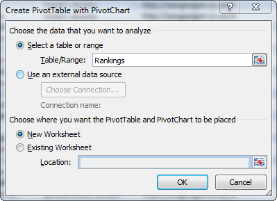
Pivot tables were designed for exactly this type of application, and making them is heaps of fun. Let’s start by selecting “Insert > PivotTable >PivotChart” in the options along the top of your Excel ribbon.
You should see a window appear like the one below. Make sure you’ve named the correct range and select “New Worksheet“, followed by OK.
Drag and drop your legend, axis and value fields
The cool thing about making a pivot table is the drag and drop functionality when you’re creating the row labels and values for the table. Here’s the visual explanation of where to put your keyword, date and position data:
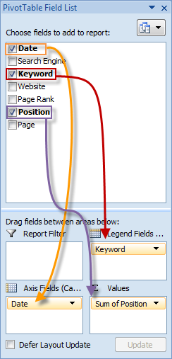
Now, filter for the keywords you’d like to create a chart for. It’s quite impractical to create a chart with hundreds of keywords, but you can add a good number for comparison purposes. Head to the “Column labels” drop down and filter for the keywords you’d like to build the chart for:

Filter by search engine
If you’ve collected data on multiple search engines, you’ll need to add a filter. Drag the “Search Engine” field down into the “Report Filter” section, and select the search engine you’re interested in using the drop down at the top of your pivot table.
 Format your chart nicely
If you’ve followed the instructions so far, you’ll see a slightly noisy and weird looking bar chart, so next we’ll create a line chart to show the positional changes over time.
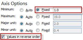
For pure charting awesomeness, a simple right mouse click on the chart, followed by “Change chart type > Line“, will do the trick. Finally, you’ll need to reverse your Y axis, leaving position 1 at the top and your lower rankings at the bottom. Using your right mouse button, click on the axis and select “Format axis” – you should see a window like this:
The end result
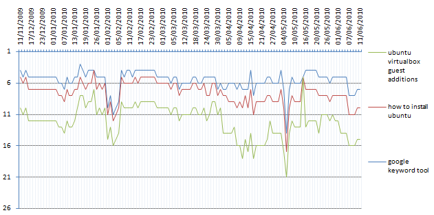
After spending some time having fun with formatting, you can create really nice charts. Here’s mine:
Hope you find this approach useful – it’s certianly handy for visualising rankings over time. Enjoy!
 Format your chart nicely

Ralph du Plessis
This is starting to be a tired old record here, Richard, but you keep posting stuff just when I need an example or solution to something. One day, if we ever meet face to face, I will buy you a pint for every useful nugget you have given me :-)
richardbaxterseo
thanks a lot Ralph, really appreciate the kind words! Speak soon!
Damion
Can anyone help me with exactly how you output the results from Advanced Web Ranking?
AWR has dozens of permutations I’ve tried in terms of types of reports, inclusions in reports, sort-by’s and whatnot.
I’m going slowly crazy trying to output just the data in the first screenie of the Excel table above. It keeps spitting out excess data, wrongly-sorted, I feel like I’ve tried everything!
AWR, great program but too many options (for me to comfortably work with anyway) :-)
Any and all help gratefully received
Damion
richardbaxterseo
Hi Damian
You need the enterprise licence – do check that’s teh case. If so:
Project > Project settings > Export > Data Export > New Data Export > Current Rank > All Data > Format CSV > Next > Generate Report Immediately
It’s a bit of a mission! Hope that helps!!
Damion
Hi Rich,
Ahh ya got me — I have the Professional license, not the Enterprise.
If I come up with a sensible hack for non-Enterprise users wanting to play with the data I’ll let you know.
Cheers
Vince
Great article as with all the other articles on this exceptional blog,
I had a question for you please, on your final graph the dates are shown as weekly, even thou within the spreadsheet the dates are set daily. I have produced my graph but having issues with getting it to show the weekly dates, I have followed the pivot steps but keep on getting the daily dates within my graph.
Could you please let me know how I can get this issue resolved?
Many Thanks,
v