Briefing
We’ve written before about the power of a robust brief; and powerful it is. Creating a brief is not only one of the places in which the curse occurs the most but it’s also where correct communication is crucial to avoid mistakes, longer lead times and extra costs to the business.
Let’s take a look at an example of a briefing email where the curse is present. Below, you’ll see some the tell-tale signs of the curse (assuming knowledge, abbreviations and brevity):

So many questions! Who is TOG? How much time do we have? How many pages? How long do the snippets have to be? Why do we need to write these? Are there CTA and linking opportunities?
To the briefer, it might seem that all the information is there, but it’s the detail that’s missing. Here’s how this email should look:
Hey XX,
Below is a brief for an on-page optimisation project we’re working on for The Office Group (TOG). You may have already seen some communication, but I’m going to run through it all just in case you’ve missed anything.
All the info should be there, but let’s grab 15 minutes this afternoon to run through it in person and answer you need more clarity or context on.
The client: The Office Group provides office space, co-working, meeting rooms and shared offices all around London, with locations in Bristol, Leeds and Germany. They are known for their stylish décor, flexible contracts and central locations.
Link to TOG main site: https://www.theofficegroup.com/
The task: Write 40 building page content snippets and 139 meeting room content snippets (100-150 words each) describing the building or meeting room, the area, the facilities within the TOG space and why a person might want to work from/move their office into/book a building or meeting room.
Link to meeting room pages: https://www.theofficegroup.com/meeting-rooms/uk/london
Link to building pages: https://www.theofficegroup.com/uk/workspaces
The aim: We need to write these unique content snippets for each of the building pages and meeting rooms for three reasons:
- To avoid duplication/cannibalisation across the pages.
- To optimise the copy with keywords.
- To enhance the user experience with informative descriptions that match the creative and friendly tone that is reflected across the rest of the site.
The audience: Office managers, CEOs, freelancers and entrepreneurs looking for a space to move their business into or a meeting room to book their next pitch, client meeting or training in, for example.
The tone: TOG’s tone is friendly, informative and slightly elevated. You’ll find good examples of their tone of voice across their site.
Call-to-action: We would ideally like the reader to either book a visit or get in touch if they’re looking at the building copy or if they’re reading the meeting room copy, we’d like the user to book a meeting room. Please keep these goals in mind while you’re writing.
Research: For some inspiration, have a look at some other content snippets on shared working space websites, such as WeWork, LABS and AllBright.
Time: You have 4 days to complete this.
Attached are the links that you need to write for and the keywords to include for each page. If you could please write within an excel document that would be great.
I’ve sent you an invite for a meeting this afternoon, but any questions in the meantime please let me know.
Thanks,
XX
There’s a big difference. Everything is clearly and simply explained, with no detail missed and no assumptions made. Yes, this brief is considerably longer than the first, but spending a bit of extra time at the start saves a lot of time correcting mistakes further down the line.
Pitching
Pitching can appear in many forms: pitching for new business, pitching to win a campaign, pitching yourself for a job. But in relation to the curse of knowledge, I want to talk about pitching to journalists, as this could be a situation where you not only need to explain your point well and quickly due to journalists’ busy schedules.
Our digital PR team are dab hands at pitching and while our team always consider the journalist’s prior knowledge on the topic they’re pitching, some of our ideas are quite convoluted, requiring concise and clear explanations of our campaigns.
Here’s an example of a fabricated pitch for a guide to saving money at the Edinburgh Fringe, which could have been confusing for a journalist with no background on the topic:

Again, all the information is there, but the sentences seem to be disconnected. The email not only leaves me asking questions (who is Towergate?), but a journalist might be left wondering: why should I care?
Perhaps a better pitch email (and one that we used for this campaign) is the below:

Here, we give the journalist an introductory sentence to make the point of the email relevant, which then links seamlessly to the following sentence. We’ve also provided with more details, while also highlighting to the journalist a benefit of using the guide (it could allow people to save the reader money) and explained how the guide could be useful for their publication’s readers.
Training
In my last post, I opened with an anecdote about conducting grammar training that didn’t quite get the point across because of the curse of knowledge. I’ve since revisited this training and will be taking you through what I’ve learnt.
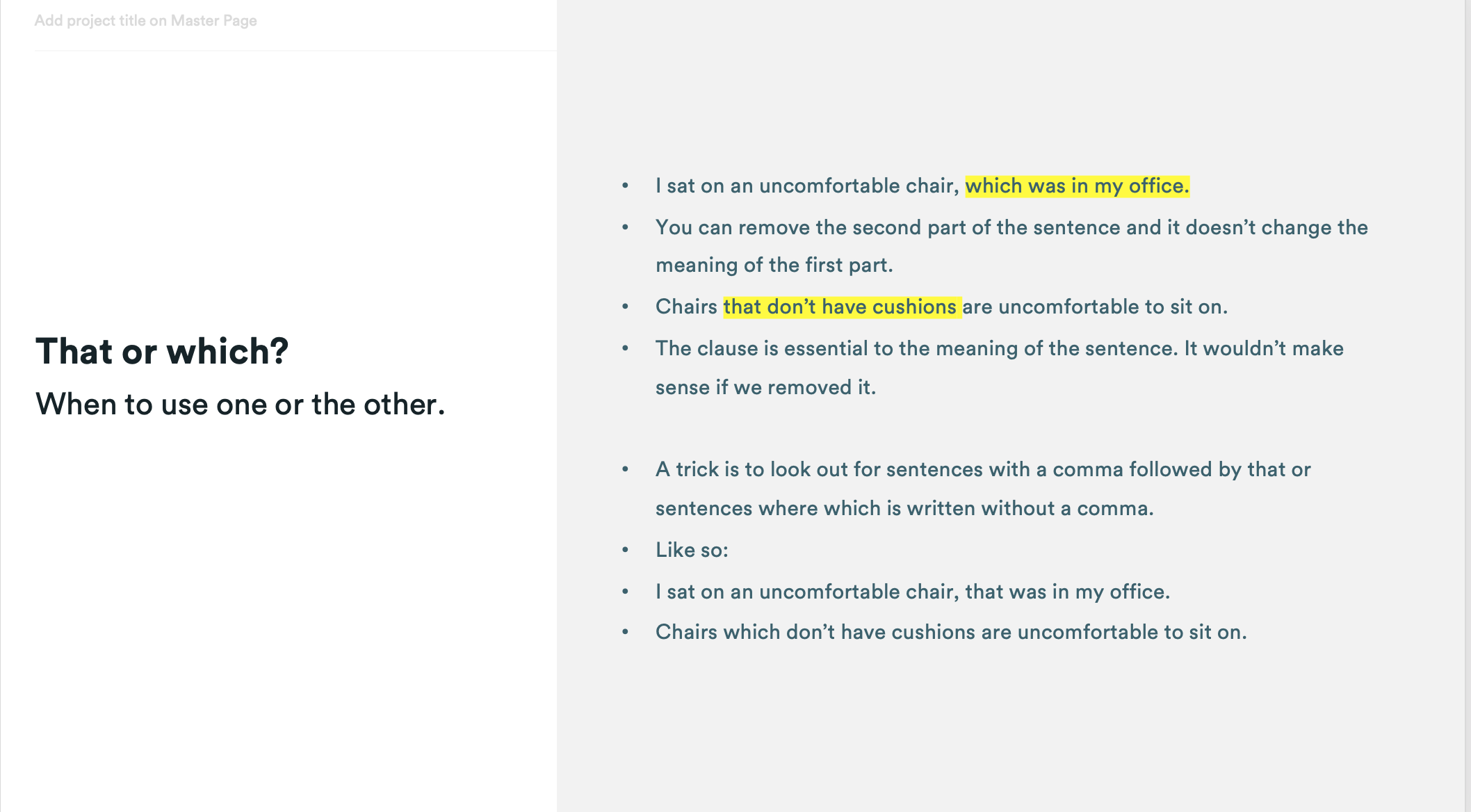
Below is the slide describing the difference between ‘that’ and ‘which’ that perplexed the training attendees. It doesn’t explain why you should use one or the other, the explanations aren’t complete and it’s just all-round confusing.

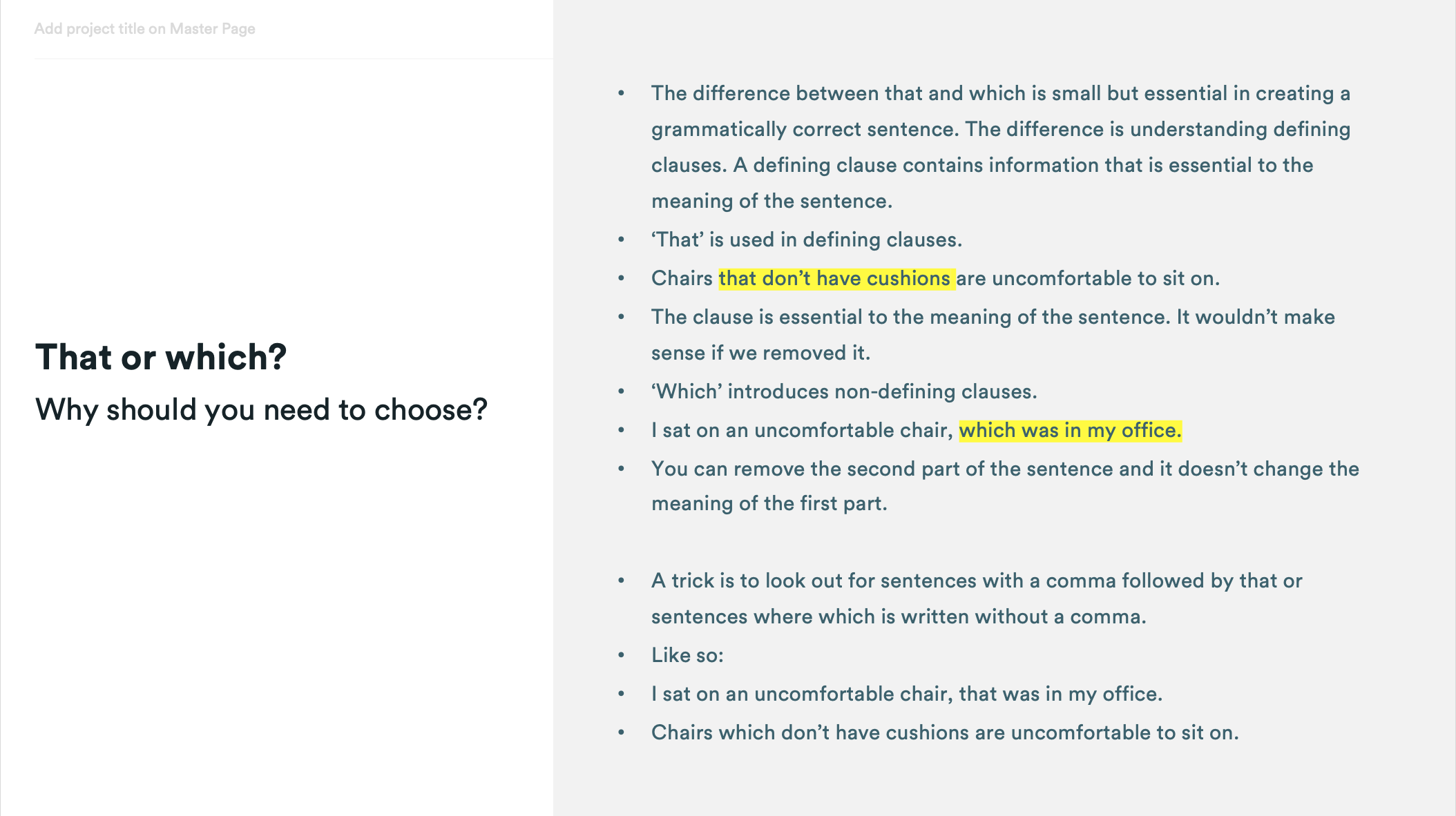
Here’s how this description should have looked:

All it needed was a bit more context to make sense. A couple of things I added were to give the class a topic, such as bicycle or toast, and ask them to write a couple of correct sentences about them using ‘that’ and ‘which’.
If you’re working remotely and delivering training, you’ll most likely send the training deck out to the participants following the session, which is why it’s even more important to make them as detailed as possible.
Instructing
So much of our communication is now done online, which can make describing even the simplest of instructions difficult. When you add the curse of knowledge into the equation, it gets even harder.
The top tips to follow when trying to avoid the curse of knowledge when giving instruction is to break them down to their most granular level, use visuals and double-check everything makes sense once the instructions have been given.
Our blog is a place where we often give instructions to show our readers how to achieve the industry tricks that we use themselves.
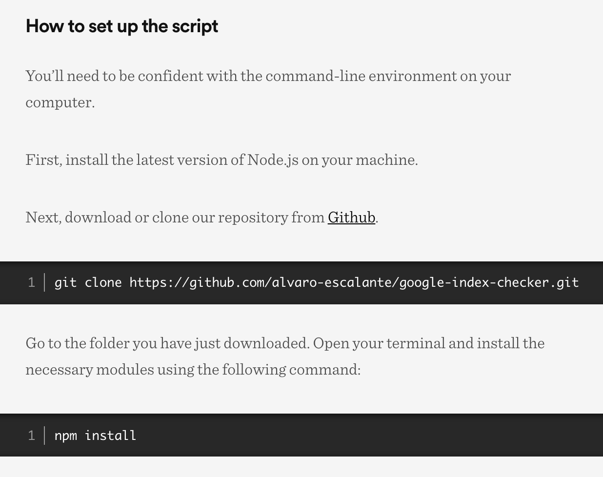
Here’s an example of an instruction to set up Builtvisible’s Indexation Checker script written by one of our SEO consultants, Jose.

The instructions are clear, simple and let the reader know what capabilities they should already have so there are no surprises. And here’s how the instruction could have looked if written with the curse of knowledge:
How to set up the script
Install Node.js on your machine and download or clone our repository. Once you’re in the folder install the necessary modules.
To an SEO, this makes sense, but to the untrained eye this could be confusing. Also, the steps aren’t clearly defined and there are key details missing.
Whenever you’re writing instructions, be sure to put yourself in the readers shoes. Re-enact the steps yourself and write them down as you go to make sure nothing is missed. Something as simple as where to look on the screen for a particular button could be super helpful, so keep the little things in mind.
Where does the curse appear for you?
The above real-world scenarios are just four examples of the most common places where the curse of knowledge can get in the way of an audience’s understanding while working remotely. By using the above to help, as well as the tips laid out in part 1, your communication while working from home will be as streamlined and well-explained as ever.
