Fear of missing out
If the rise of the acronym ‘FOMO’ is anything to go by, humans not only don’t like to miss out, we pre-emptively fear the feeling it gives us. Creating scarcity – feeling the need to buy before quantities are gone – plays on this insecurity. How do you add scarcity? Include how many items of stock you have left in your inventory on your product pages.
This sets a hard limit and the simple existence of this limit kickstarts more people to buy. Seeing a lack of stock instantly induces a sense of urgency in the consumer, making them want to buy one of the last remaining products, so they don’t miss out.
In a nutshell, if you reduce the quantity supplied of a product or its availability you create a scarce product. This perceived scarcity then allows you to sell more.
Add urgency
Putting a time limit on your product pages, usually through a limited offer, takes advantage of the loss-aversion phenomenon. It is believed that we’re twice as susceptible to the pain of losing than the pleasure of gaining, meaning humans are more loss-averse than gain favouring. Customers might be more likely to transact sooner than later because of this limited value assignment, feeling a need to buy an item before it’s too late. Adding urgency can increase add-to-basket rate by 20%.
Social commerce
Think about why your customers are on your particular product page. Maybe it’s word of mouth or a current trend in which your product fits the bill. When your customers are shopping, decisions are often influenced by the buying decisions of others. This is social proof – a psychological occurrence in which humans conform to actions of those around them in an attempt to display the correct behaviour in that situation. This is all down to our desire to fit into a group.
Showing your customers how many people have looked at or have already bought a product encourages this conformity. The higher the number, the more likely the consumer is to take notice and make the transaction.
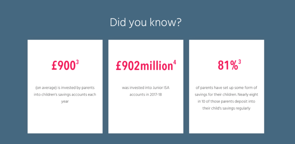
Vitality, the healthy insurance provider, exercises social proof in an interesting way; the combination of letting customers know the amount people are investing in Junior ISAs and the percentage of parents who have already set up a savings account for their children nudges parents to consider the same for their family.
Set expectations
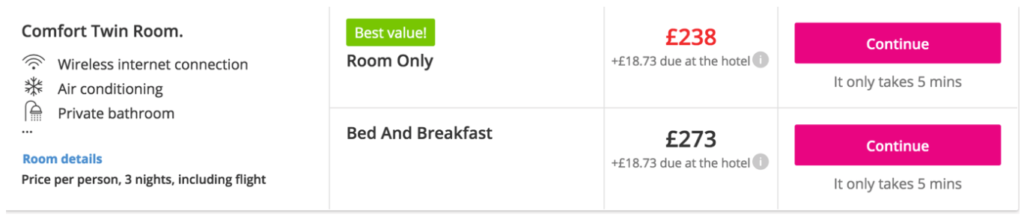
Time is our most precious commodity, so letting the user know how long a transaction will take, how long it will take to get a quote, or how quickly you’re able to respond makes the users more likely to take action because they’re confident of the outcome. It’s better to say ‘sign up in 3 minutes’ than ‘only takes a couple of minutes’. Lastminute.com use this tactic by telling customers how long booking a holiday will take.
Features tell, benefits sell
When writing product descriptions, consumers want to know how the product is going to alleviate one of their pain points (not enough time, stressed, broke) as opposed to a breakdown of the product’s physical attributes.
If you’re struggling to find the benefits of a product, ask questions and answer them clearly in the product description.
Questions like this work well:
- How does the customer use it?
- What problem does it solve?
- How is it different from the competition?
- How long does it last?
- How economical/sustainable is it?
- Has it won awards?
Strip it back
You may find when you’re talking about the benefits that you end up writing a short story about each product. Consumers are impatient and will instantly turn away if they see a long, descriptive passage. Get to the point and keep it succinct. A three-line product description is the optimum, with some bullet points to describe the key USPs and specs. Cluttered product pages are off-putting, so only display the most valuable information to the user and declutter everything else. Chunk the text, bold the benefits and make it scannable. This is especially important when thinking about mobile commerce.
Add feel, fit and weight
Over 50% of consumers who shop online say that the biggest drawback is the inability to feel and try the products before purchasing. While good product imagery will get consumers some of the way, this won’t tell them everything. Adding the feel, weight and fit makes the product as tangible as possible allowing the consumer to make a well-informed purchasing decision.
French Connection, a clothing retailer, describes the fabric of each product using three adjectives.
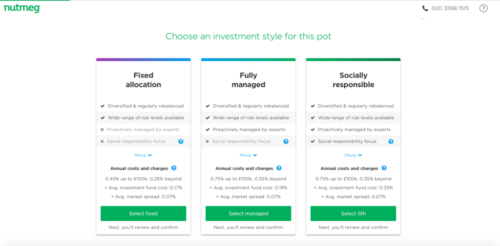
Side-by-side comparisons
Side-by-side product comparisons lean on a component of decision theory called distinction bias. In a side-by-side comparison, distinction bias makes us over-analyse near-meaningless differences between two similar choices.
The intention with a side-by-side comparison is to draw attention away from the cost (a key factor in decision making) by comparing smaller, arguably less significant details.
Nutmeg, an online investment management company, has created a clear comparison of the types of investments on offer.
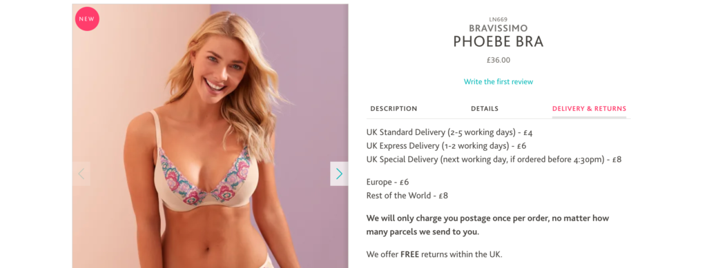
Clarify delivery and returns
Delivery time is a barrier from the customer getting their product immediately. Having to return the product through the post then adds to the annoyance. Making delivery as fast as possible and returns as simple as possible makes customers grateful, winning repeat business. Having a return policy can also be a huge trust influencer when it comes to purchasing decisions as a decent policy shows faith in the quality of your products.
Most good retailers tend to:
- Offer a reasonable return period (of between 14 to 30 days)
- Make sure all terms and conditions of return are accessible and clear
Bravissimo, a lingerie retailer, exercises this through a dedicated delivery and returns tab on their product pages.
Gain trust
Trust Badges let the consumers feel like they’re in safe hands, whereas adding testimonials and reviews on top of that creates a level of transparency – you’ve passed the baton to your existing customers to sing the praises of your products.
If a user feels like they’re in trusted territory, it’s possible they will amplify other behavioural tendencies, like impulsive buying behaviour.
Prioritise mobile
Customers now favour mobile commerce as the shopping device of choice, with 62% of smartphone users shopping via a mobile device. Depending on the size of your business, an app might not be an option, so SMEs should dedicate a significant portion of budget towards a mobile-optimised site. Shopping on mobile is a completely different experience to desktop browsing, so UX needs to be taken into consideration. There are plenty of quick wins you can do to optimise for SEO, but it’s best to consider mobile as you’re creating your desktop site, because things like imagery play a big part in getting m-commerce right. Have a look at our extended post for optimising product pages for mobile.
Put yourself in their shoes
You’ve gone through all of these steps and your product pages still aren’t converting. This may mean that there’s a block in a significant pipeline to your product pages. Put yourself in your customers’ shoes and do tests going from the upper end of the funnel all the way to the product page, noting down anything that you get stuck on. Browse through products, dip in and out of pages, fill in forms and maybe even make a test purchase. Think of any conceivable way your customer might be trying to reach your product pages and go through them. Ask friends and family to go through your funnel and get them to talk through their experience as they’re doing so.
These insights should give you plenty of ways to amplify the conversion on your product pages and ultimately bolster your profit.