Page speed quick wins you can implement and how to identify and test them using DevTools
Before we jump in, we want to share a useful tutorial for how to use DevTools which covers the fundamentals for inspecting and analyzing web pages. This will be extremely useful as we progress through these page speed issues.
1. Preload fonts to prevent flashes of unstyled text
Flashes of unstyled text (FOUT) are instances where the font resource required to properly style text on a webpage hasn’t been loaded before the text itself, causing the browser to use a backup font in replacement.
Flashes of unstyled text can impact page layout shifts (Cumulative Layout Shift). A great example of this is https://www.telegraph.co.uk/ where a flash of unstyled text in the hero image causes a relatively large upward shift in page content:
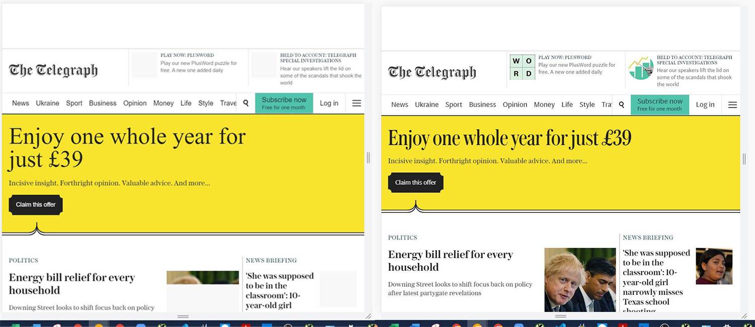
As we can see above, the heading placed within the hero image is rendered in using a backup font until the correct font has been loaded, upon which the text switches to the correct style.
Because the backup font has a naturally larger style, more space is accounted for to accommodate the text. The smaller font is then rendered, causing an upward shift in page content.
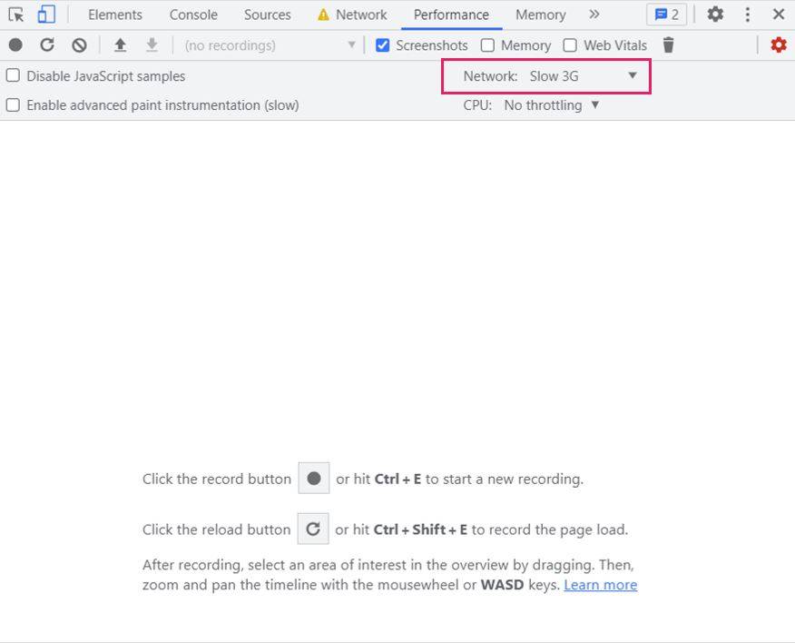
You can view this page layout shift yourself by running a performance report in DevTools. Set the ‘Network’ setting of the performance report to “Slow 3G” to get a good picture of how the page performs for slow mobile users:
The resolution of this issue is a simple one. We need to first identify which font is the main font required for the final text, and then preload it so it is requested before page load. That way there will be no need to use the backup font, eliminating the layout shift.
By inspecting the text in question using DevTools and then shifting our attention to the “Styles” tab on the bottom right-hand side (depending on where you have situated your DevTools interface), we can see which font family is used for the text and the CSS file used to render the text:
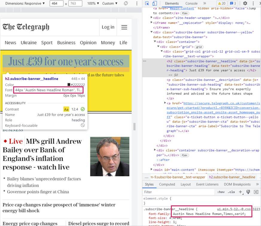
In this case, we can see the font family is “Austin News Headline Roman” and the CSS file is “.min.5-128–0.css”.
We can then switch to the ‘Network’ tab and use the search bar and plug in our font family and find the exact URL of the font resource:
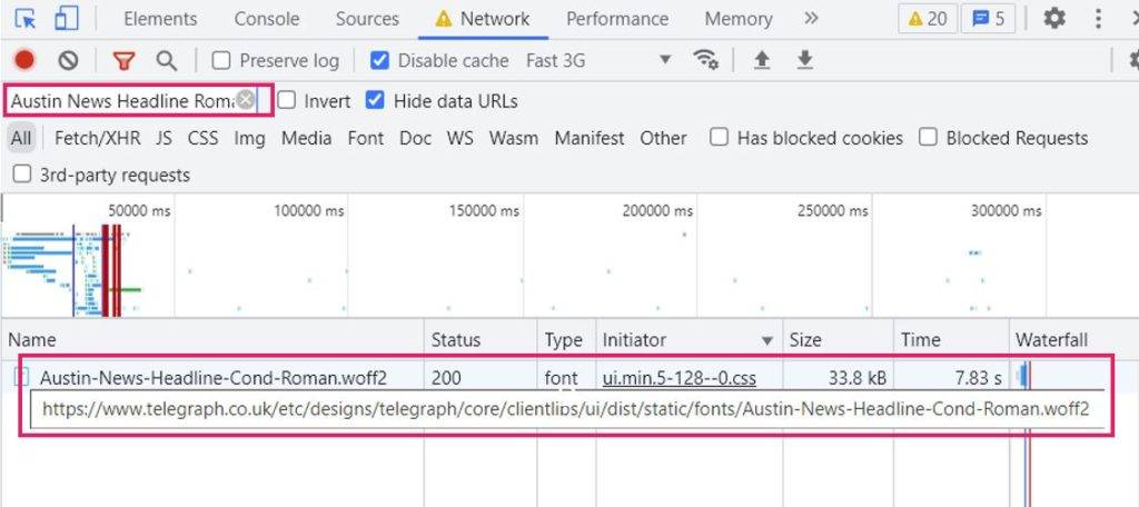
Now that we have the font file, we can add the following piece of code into the <head> of the page to tell the browser to preload the font before the body content is rendered:
alvaro
<link rel="preload" as="font" crossorigin="crossorigin" type="font/woff2" href="/etc/designs/telegraph/core/clientlibs/ui/dist/static/fonts/Austin-News-Headline-Cond-Roman.woff2">To do this, we need to enable Local Overrides in DevTools. Head to ‘Sources’, click on the 2 arrows in the nav bar and click ‘Overrides’. From here, you can select the folder on your local computer you would like to save changes to.
Note: You may need to allow Chrome DevTools to access this file location by accepting a prompt which will appear at the top of your DevTools tab interface.
Below is a video showcasing how we can add the snippet of code above to the source HTML of the page and save the edits locally (you will know your edits have been saved as a purple icon will appear next to the name of the tab “Index.html”):
Saving the above changes (by hitting CTRL + S) and rerunning the performance report shows us that the layout shift has been resolved. The following video shows the page load before:
And this is how it loads after:
If you have flagged that your site suffers from poor Cumulative Layout Shift due to flashes of unstyled fonts, check if you aren’t already preloading the respective fonts needed for the text causing you issues, add your snippet of code and test the impact using DevTools.
2. Image optimisation
Images can cause huge page speed issues and are one of the most common contenders for long page load times.
There are several issues related to unoptimised images which cause a slower page speed, including:
- Images in old generation formats
- Oversized images
- Above-the-fold critical images which aren’t preloaded
Let’s dive into each of these in turn and dissect how each one presents issues and how to fix them.
a) Images in old generation formats
A site which suffers from poor page performance due to unoptimised images is:
Running Lighthouse shows that they could shave an estimated 11 seconds of their load times by serving images in next-generation formats, which is huge!

Upon inspecting Anderton’s images on the home page using Chrome DevTools, we can find that they are in JPEG format. For Andertons to improve their page speed, they could use next generation formats such as WebP or JPEG 2000 which load faster for users due to increased compression.
b) Oversized images
Not only this, but Andertons can also properly size their images, i.e. serve images in the optimum size required for the page template across all devices.
Inspecting the ‘Spring Sale’ hero image in DevTools (using a widescreen monitor at 125% zoom) shows us the following dimensions:

The image is being served at 624 width and 426 height.
Opening the image in a new tab and inspecting again shows us that the image is being provided at a much larger size of 1052 width and 714 height:

This will waste unnecessary time and resource during page load as the browser will need to work hard, especially for mobile devices, to reduce the size of the image to fit within the display of the respective device.
The solution here would be to serve the image in the largest size it is required to display for users, that way no unnecessary resources are wasted during page load.
c) Preload important images
A very easy change Andertons can make to their home page is to preload the hero image which is considered the Largest Contentful Paint (LCP). Increasing the load speed of this image will improve the LCP score in Lighthouse and hopefully edge Andertons closer to passing the LCP audit.
We can test preloading the hero image locally on our computers by adding the following snippet of code to the <head> of the page:
<link rel="preload" as="image" href="https://andertons-contentimages.imgix.net/andertons-sas/images/banners/homepage/05-2022/grid-l-spring-sale-2022-new-lines-min.jpg">Running lighthouse with this change saved locally shows that we can shave 5 seconds off the LCP metric. However, it is important to note that ‘first contentful paint’ and ‘time to interactive’ in Lighthouse have seen a slight negative impact from this change:
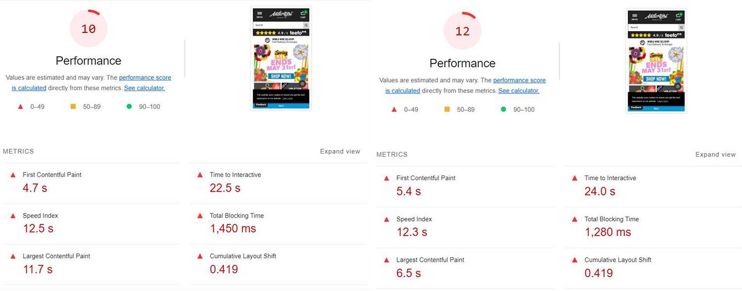
Preloading the hero image has informed the browser to prioritise the hero image before other resources. As we know already, the images on Andertons are under optimised, being served in old generation formats and in the incorrect (excessive) sizes.
This is causing the browser to take longer to fully load the image when it receives our preload request, having a negative impact on how quickly the ‘first contentful paint’ is loaded, and how fast the site becomes interactive.
This stresses the importance of actioning the previous points on your site before considering preloading images as it could have the reverse (negative) effect on certain page speed metrics.
3. Eliminate render-blocking resources
CSS and JavaScript files are considered render-blocking resources as, by default, browsers pause the rendering of the page to request and parse these files. Only then can the page continue to be built and served to the user.
Heading back to Andertons, we can see that they can shave 2 seconds off their page load time by eliminating render-blocking resources:

We can identify render-blocking resources by opening this issue up within Lighthouse to see the potential savings available to their page speed:
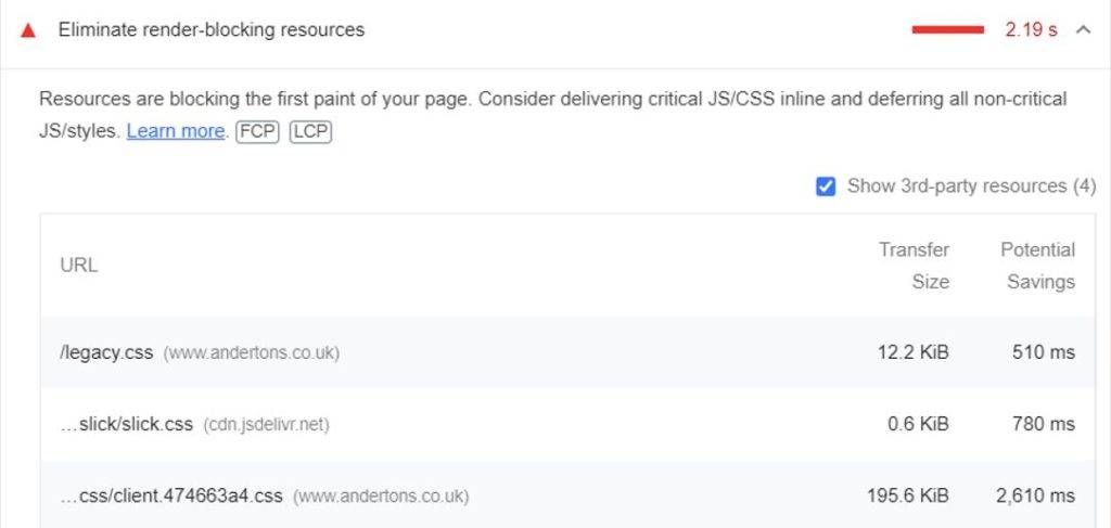
Alternatively, we can use the brand new ‘Performance Insights’ tool within Chrome DevTools which is currently only available on Chrome Canary (a test version of Google Chrome used to test new features and tools).
Running Performance Insights on https://www.andertons.co.uk/ highlights points within the page load journey in which resources block rendering:
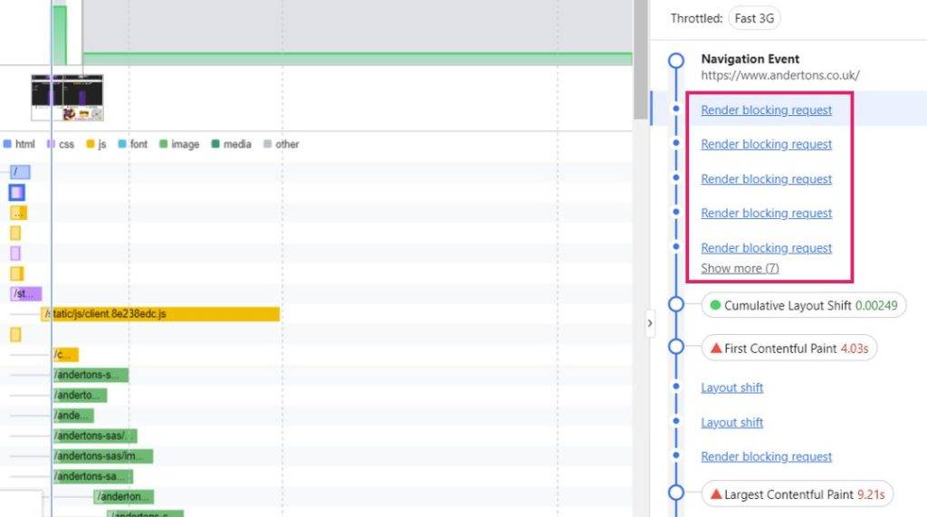
The below script holds the greatest potential savings for Andertons (2.6 seconds):
“https://www.andertons.co.uk/static/css/client.474663a4.css”
In order to identify the most appropriate solution, we need to gauge whether this CSS file is critical or non-critical, i.e. is it needed to render the page content for initial page load, or is it required for off-screen content?
To do this, we need to open ‘Coverage’ within DevTools, rerun the analysis if necessary (you will see this message appear in the middle of the Coverage interface) and find for our CSS file the resource list:

As we can see on the right-hand side, 99% of this file is red (non-critical) indicating the majority of the file is not required for initial page load. Alternatively, it could be that 99% of the file is not used at all for any elements on-page.
Despite that, the small CSS that is required may be required for initial load, so removing the CSS file entirely may not be the best route. Instead, we have to understand how we can reduce the impact the CSS file has on the rendering of other resources after it.
We need to stop this CSS file from blocking rendering. To do this, we can add the below CSS code in the <head> which includes the ‘preload’ attribute:
<link rel="preload" href="/static/css/client.4210ae49.css" as="style" />The preload attribute tells the browser to prefetch the resources without having to execute them, this means you have more control over when and how resources are loaded. This is a good solution because we don’t actually want the majority of the CSS file to be executed right away.
There is another resource present on Andertons home page which is blocking rendering. A JavaScript file provides a 1.2 second saving on page speed if eliminated. The solution for JavaScript is slightly different to dealing with non-critical CSS.
Checking this script in the coverage tab shows that 87.5% of the script is non-critical:

Again, for simplicity, we are going to treat this file as if it was 100% unused.
The next step is to change the way this script is treated by the browser, either by adding a ‘defer’ or ‘async’ attribute to ensure the resource does not block rendering.
Defer: Deferring a file means that it will load when the DOM has loaded, without delaying page load first. This makes the defer attribute useful for JS files which are not required for above-the-fold content or initial page load.
Async: Async also downloads the script asynchronously, but the file is executed as soon as it is ready, instead of at the end of page load. This makes async useful for JS which is required for page load but is negatively impacting load speed.
The JS file in question is present in the <head> of the page and is therefore likely required for above-the-fold content. With that in mind, we can add an ‘async’ attribute to the script to ensure it is loaded when ready but does not block rendering.
After adding both the defer attribute to the JS file and preloading the CSS file, we can see that the potential savings from render-blocking resources have reduced from 2.2 seconds to 0.4 seconds after optimising just two resources:


4. Removing layout shifts caused by cookie banners
Cookie banners can be a nightmare for Cumulative Layout Shift, causing large shifts in page content which irritates users who are trying to interact with elements of your site.
Typically loaded near the end of page load once all the content is displayed, they can sometimes appear at the top or bottom of the page, pushing all of the loaded content upwards/downwards, which is a big no-no when it comes to Core Web Vitals.
We found a great example of a problematic cookie banner on https://www.bbc.co.uk/news/entertainment_and_arts.
The screenshots below show how most of the page content is loaded in and then the cookie banner loads, shifting all of the content downwards.
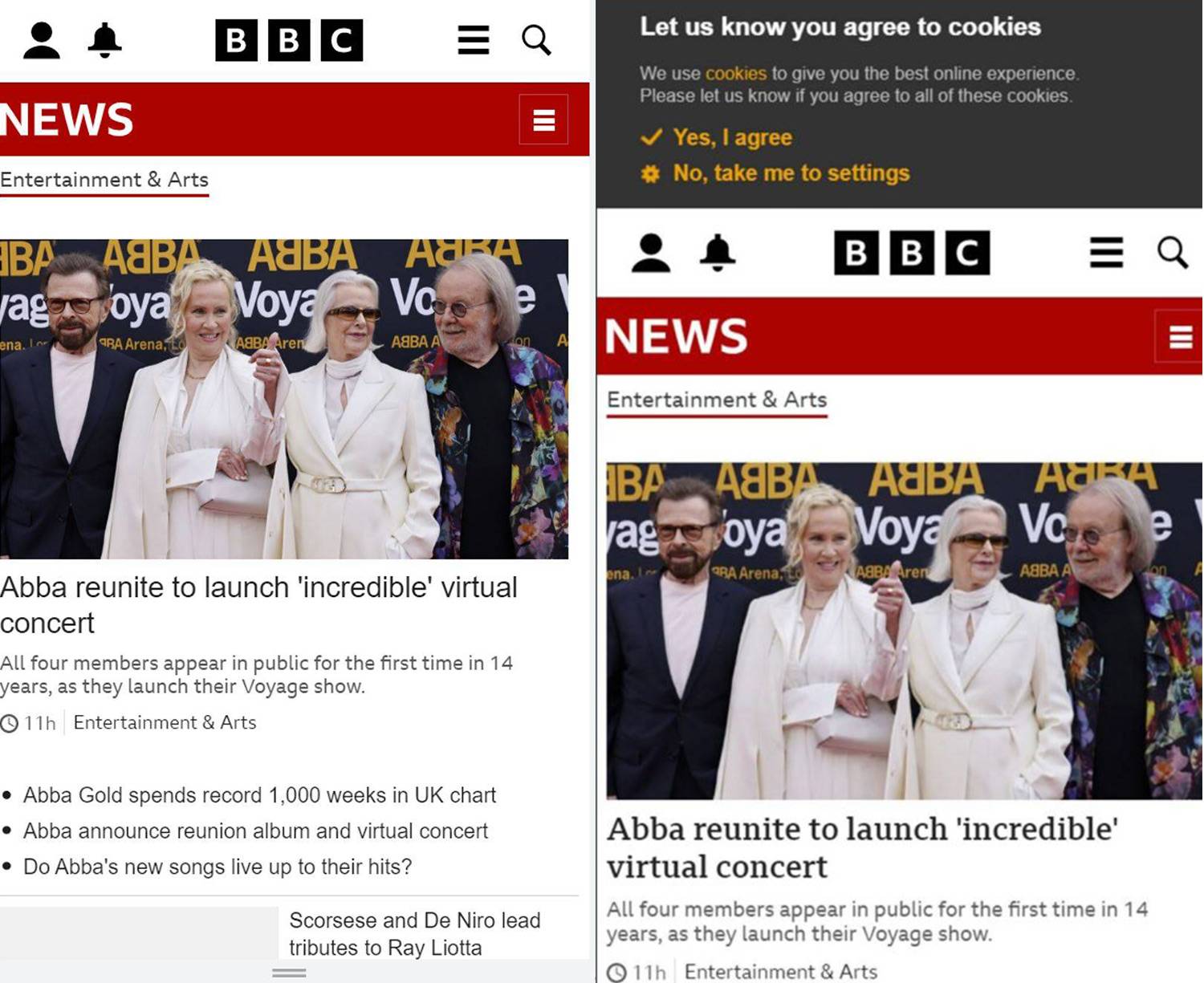

This layout shift is causing the page to fail the Cumulative Layout Shift test (score of 0.314, benchmark is 0.1). There are several layers to this problem which we have broken down below:
a) Properly ‘positioning’ the cookie banner element
The first issue is that the cookie banner is not considered as it’s own element sitting on top of the page, but rather part of the body content. This is the primary cause of the layout shift.
To fix this, we need to position the cookie banner above the page, separating it from the body and removing the layout shift entirely. We can do this by adding the following code to the CSS file of the cookie banner element:
position: fixed;b) Fix banner to the bottom of page
The second issue is that the cookie banner is positioned at the top of the page. Therefore once we fix the position of the banner, it is going to block the top of the page content from users’ view:


The text “elections 2022” and internal link elements pointing to ‘latest stories’ and ‘most read’ are blocked from the user.
Luckily, due to the way the top navigation is styled, it sits on top of the cookie banner. If this wasn’t the case, the top navigation and brand logo would also be blocked from the user.
To fix this issue, we can switch the position of the banner to the bottom of the page which is a much more suitable place for it to sit:
bottom: 0c) Bring banner to the front of page display
Finally, to complete the change, we need to bring the cookie banner to the front of the display.
Whereas before, the banner was above the top page content blocking it from view, when positioning it at the bottom, it is now the banner that is blocked from view:


The final piece of code we need uses a ‘z-index’ value which controls where the content sits in the hierarchy. Setting this to ‘999’ ensures the banner sits above all other content:
z-index: 999Below is a video demonstrating how we can add all of these pieces of code to the appropriate CSS file to improve the CLS score for BBC news.
If your webpage is suffering due to layout shifts caused by cookie banners, follow the above process and test the changes on your site using DevTools. If they resolve the issues and help your page pass the CLS audit, this will provide you with a great business case to get this change implemented by your developers.
5. Improve your caching policy
Caching static resources helps to reduce roundtrips made to the server for returning visitors. What I mean by this, is it allows the browser to serve resources from a cache (local store) instead of requesting them again and again from the server every time users revisit the site.
A great example of this is https://www.nike.com/gb/. Lighthouse shows a number of scripts and resources which have a short cache policy, meaning there is a very short period where the browser stores them before it removes them and will require re-requesting from the server.
In some cases, some of their resources have no cache policy whatsoever:
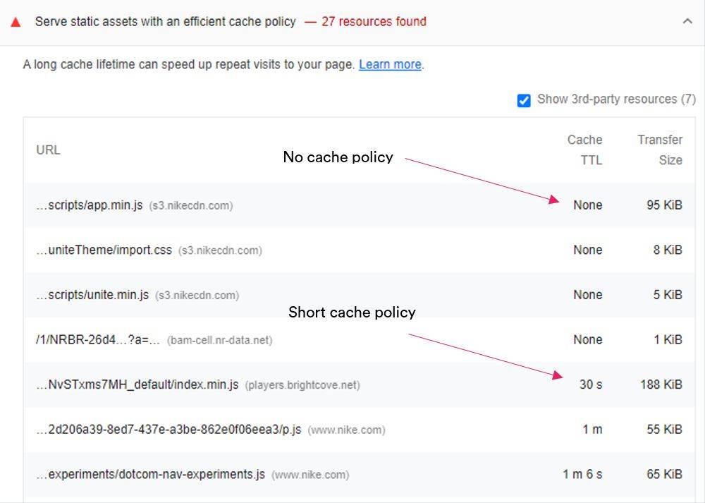

Some of these resources have a large transfer size. Caching the resources would have a positive impact on load speeds for returning users.
To fix this issue, the cache time should be increased to 6 months to capture as many returning users as possible. A caveat to this is if resources are frequently updated, in which case the cache policy should remain shorter depending on the frequency of the changes.
As caching is done through your server, you will need to speak to your web developer about implementing this change. It’s also worth bearing in mind you may not be able to control externally hosted resources.
Happy hunting!
There we have it. Five areas which are common contenders for poor page speed / Core Web Vitals, how to identify and dissect them within DevTools, and how to make local edits to your site and measure the impact on performance.
We hope you have learned a trick or two from this post and have actions you can take away to your site to help push page speed changes through the door.
