CSS media queries
This post will focus on a particular approach to site responsiveness, the css media query. The only thing required is a basic knowledge of html and css.
A media query allows you to specify the style of a web page depending on the dimensions or type of ‘media’ that the site is being viewed on. Design considerations when designing for desktop and mobile are very different, media queries allow you to use the same HTML structure for the website but adapt the design based on the media being used to display it. You can think of media queries as a way of using multiple style sheets without having to use any extra client or server side code to detect the device or size of the device being used!
Media queries, when used correctly, can be more effective than a separate mobile website and can fit any screen size, whilst a mobile website will generally be limited to a single size – thus causing wasted space when using a screen that is slightly larger than the default 320px. The number of android devices available on the market with varying screen sizes is a testament to this fact – media queries are the best way to ensure your site looks the best and uses the available screen real estate to the maximum effect.
How to use them
Media queries are quite relaxed and there are many different ways you can use them. As long as you follow a few syntax rules when defining the query, the rest is up to you. Here I will concentrate on using media queries dependent on the dimensions of a device, but you can also specify any of the following media types:
media_type: all | aural | braille | handheld | print | projection | screen | tty | tv | embossedJust like with regular CSS, you can apply a media query on a link element in the header which will link to a stylesheet specific to the media matched or you can embed the code within the html.
<link rel="stylesheet" media="(max-width: 800px)" href="example.css" /><style>
@media (max-width: 600px) {
.facet_sidebar {
display: none;
}
}
</style>
I personally use a mixture of both – I keep the standard HTML stylesheet link (with no queries) and include all my queries within one stylesheet – but this is completely down to personal preference.
To declare a media query you just need to use @media and put the query into brackets. You can use logical operators including ‘not’, ‘and’, and ‘only’ to create more complex queries. To create a stylesheet for mobile devices you could use the following piece of code:
@media  (min-width : 320px) and (max-width : 480px) {
  body {
    width: 100%;
    max-width:1000px;
    color:#000;
    margin:0 auto; /* will automatically align center */
  }

 .about {
    width: 100%;
    max-width:1000px;
    color:#000;
    margin:0 auto;
    float:left; /* at desktop size this could be floated right */
  }
}
The styling used within this query will only be used if the device screen is between 320px (the smallest resolution used for mobile) and 480px. There is no limit to the number of queries you can use although generally its best to use 3 – mobile, tablet and desktop sizes. Another aspect to consider is to avoid defining widths and heights and instead use percentages, allowing the content to resize regardless of the device size – creating a truly fluid design.
For example the following CSS will allow images to scale according to the device:
img {
  height: auto;
  max-width: 100%;
}
The height and width will automatically scale to ensure it fits on the page. The height will automatically set, just be sure to set a max-width otherwise the image will continue to grow regardless of the original image width. You can see the effect this has below. By doing it this way you will also save yourself having to declare new image dimensions on each media query.
As previously mentioned there are many different ways to manipulate the design of the page. Above we have used min and max width as the feature on which we are basing our design, however the following can also be used:
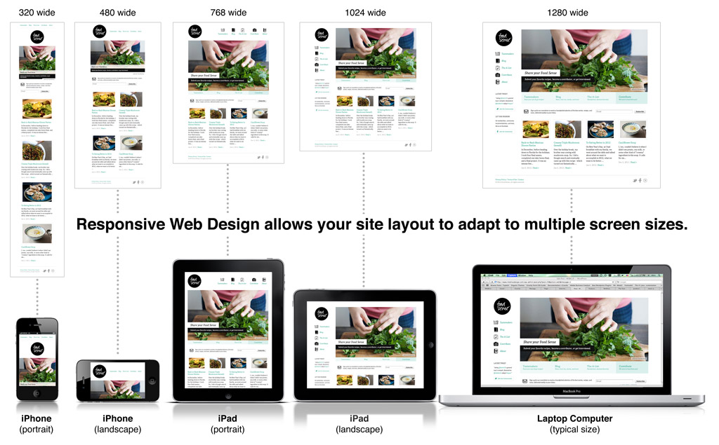
width | min-width | max-width| height | min-height | max-height | device-width | min-device-width | max-device-width | device-height | min-device-height | max-device-height | aspect-ratio | min-aspect-ratio | max-aspect-ratio| device-aspect-ratio | min-device-aspect-ratio | max-device-aspect-ratio | color | min-color | max-color | color-index | min-color-index | max-color-index | monochrome | min-monochrome | max-monochrome| resolution | min-resolution | max-resolution| scan | gridThe image below gives a good overview of device size to consider when designing media queries:
Some final advice
It’s a good idea to create a standard css before you create your queries to ensure that older browsers or those that don’t support media queries will display your site properly. When writing a query bare in mind that each one will overwrite elements previously declared. So if for example some padding is declared within the desktop media query it will also be present on the tablet or mobile versions of the site unless you overwrite it with padding:none; in the media query for mobile or tablet devices.
When using media queries you only need to declare style elements that you want to change between sizes. If the style is to remain the same across any size then that style should be applied outside of the media queries.