Get talking
It’s a cliché, but it’s as true as it is unoriginal: communication solves so many of the problems we see daily.
At Builtvisible, we maintain an in-house creative team for that very reason. It means we can be present from the point of sale, through ideation, all the way up to delivery. The earlier you catch any problems, the more time and money you save.
Even if you do happen to be in the same building as your creative team, it can be tempting to wait until design is ready to kick-off, avoiding the expenditure of inviting them into more meetings. From experience, though, that usually just costs more money later when you start having to revisit old conversations.
The same goes for establishing contact with the right teams client-side. If you wait until the project is underway, it’s too late. You ought to be defining what options are on the table—in terms of technical limitations, style restrictions, etc.—at an account level during onboarding. Without that information you can’t scope and budget specific projects.
With that general point out of the way, let’s look at some of the more specific details to consider as your project moves through the pipeline.
How is your work being implemented?
So, you want to publish something on your client’s site. It could be an interactive tool, a campaign landing page or some basic graphic assets but it’s vital to consider how exactly it’s going to get published.
For example, what page template will it sit in? Is it being hosted via the client’s CMS or as something separate from the main site? How exactly does the client need the files packaged and delivered? If you’re writing code for them, do they need you to use any specific JavaScript libraries? Do they need you to replicate their main site header and footer? If it’s just design work, what width do you need to optimise for? Are there any file size requirements to be aware of?
Those are just a few of the sorts of questions we encounter frequently. There are so many different ways that conversation can pan out, and each one will make different demands on your designers, developers and the client’s in-house teams.
From your side, you just need to be conscious of these conversations and how they’re going to impact time required, and get the right conversations happening to resolve these issues as early as possible. Usually, one phone call is all it takes.
Data considerations
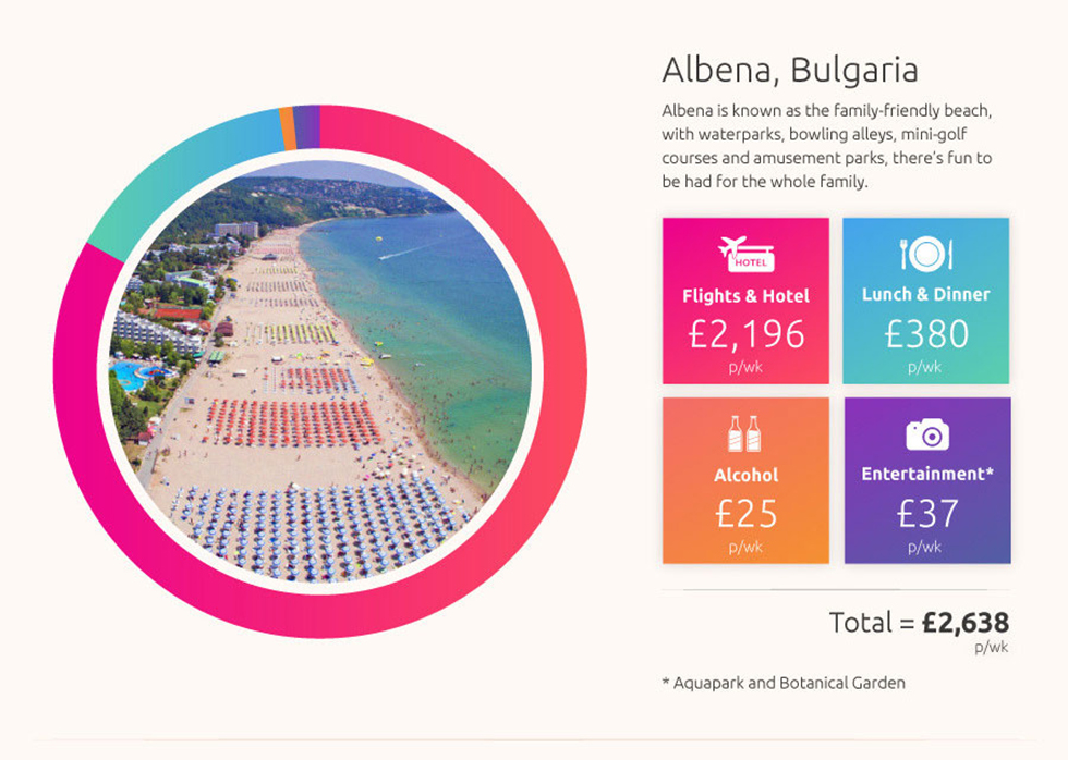
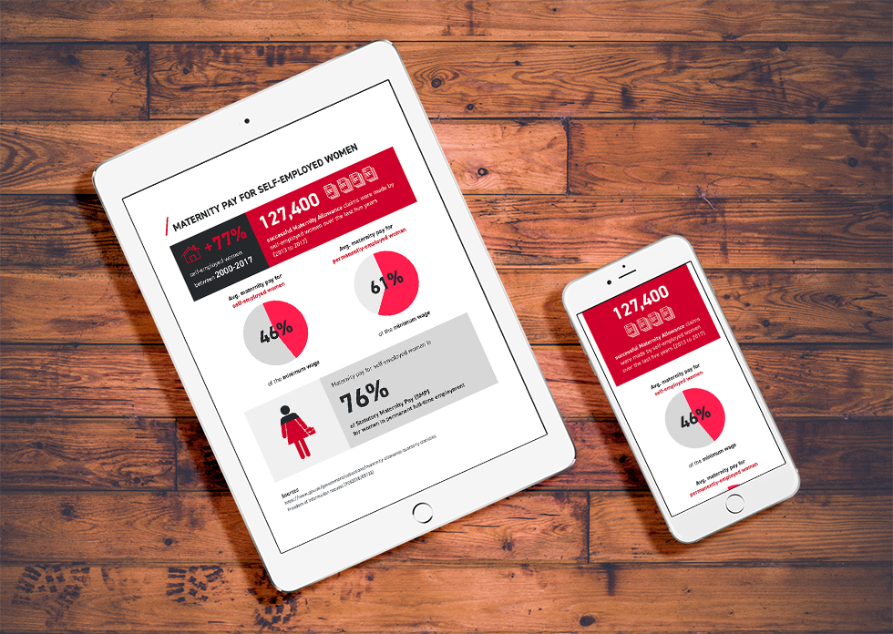
Often, you’ll be looking to your design team to present data in a striking, engaging way. Of course, your focus while gathering that data is going to be on telling a compelling story, but there are a couple of things you can watch out for at the same time to ensure your research translates into strong visuals.
Specifically, keep an eye on the maximum and minimum values that need to be represented in your data set. This is absolutely the most common issue we see causing problems in data-focused projects.
As an example, see the dataset below showing responses to a survey. The huge number of responses in favour of answer #1 stretch the scale of the accompanying bar chart. Since most of the remaining answers come in at 20 or less, you end up with this really dull-looking chart where there’s little discernible difference between answers #3, #4, #5 and #6. Compare with the chart on the right, which has the largest value removed, resulting in a much more readable, useful graph.

While a designer can work a certain amount of magic to find other ways of presenting this data, they’re still always going to be limited by that scale issue. The more creative they need to get here, the more research and experimentation budget needed to find the ideal solution.
If you spot this issue cropping up, it’s worth asking yourself if you can be ruthless about editing the data. Can you split this out into two charts, with one dedicated to answer #1 alone, so that you can separate it from the rest? Or do you have the budget to invest in exploring more creative solutions?
The other big consideration at this stage is volume of data. How much do you have to cram in? This is where some of the considerations from above will come in. Are you publishing in a 700px container? Fifty rows of data on a bar chart is going to be a lot to fit in, if so. This is where it’s best to keep in close contact with designers and get constant feedback about what’s manageable.
Copy
Copy considerations are going to be largely in the same vein as data issues—it’s all about volume.
This is going to be less of an issue for blog posts or long-form articles, but in those cases length will still affect the overall size of the page and the amount of imagery you need to break things up.
Tools and data-focused pieces are much more sensitive to overly long copy. Intros, button labels, instruction text, chart legends and axis labels, all of it needs to be as succinct as humanly possible. Too much text is liable to create layout problems and detract from the main focus of the pieces. That’s going to be the primary concern for a designer, so thinking of it from the beginning will minimise requests for redrafts.

How many assets do you need?
A really helpful exercise, and usually the first thing we’ll do when passed a document containing data and copy for a project, is to look at the number of assets required.
That’s going to be determined by a number of different things. You might feel that there’s a minimum number required in order to cover all the angles needed for promotion.
Or, perhaps your client wants to repurpose those assets for daily social posts over a three-week period, and so you need enough to cover that.
You might even be targeting specific publications, say a newspaper website that you know uses a 400px container for its body content. To really get them on board, you’ll need a version of your asset optimised for that width.

Obviously, the number of assets alone doesn’t tell the full story because the complexity of each is important—you might have only one, very complicated asset or 10 very basic ones—but it’s a good barometer for the general scale of work involved. Do also note that even if your assets are super simple, if there are fifty of them there are workflow overheads involved in tracking, managing and exporting such a large batch.
Style matters
Style is an important variable in how time-intensive a project becomes. If your client is expecting glorious, detailed watercolour-style illustrations, the quote from your design team is going to be very different from the same number of basic vector-based illustrations.

You’ll also need to think about the skillset of your team. If there’s the need for a very specific style, there’s a good chance you’ll need to hire a specialist illustrator, and that can get pricey.
Once more, this is where conversations with your design team need to be happening as soon as your idea for the project starts taking shape.
Who’s sourcing what?
If you’re working with photography in your project, who’s providing those? Does the client have a bank of approved photos you can work with? Or does everything need sourcing from stock? In the latter case, finding good stock photography can be frustratingly time-consuming, costly in terms of licensing and will probably need some post-processing time to make sure all the imagery feels consistent.
Hopefully, all this gives you a bit of insight into how your creative team will go about thinking about a project from the earliest stages, and how they’ll go about squaring the project requirements with the time they have available.
Getting into that mindset and making it a part of your natural thinking about each project will save time, money and frustration, and help you deliver solid projects on-time and on-budget.
