Optimising for search on a mobile device
For digital marketers, search on a mobile device is a mainstream digital marketing discipline that is now very different to classic desktop SEO.
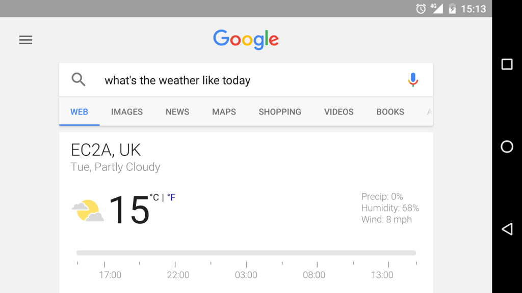
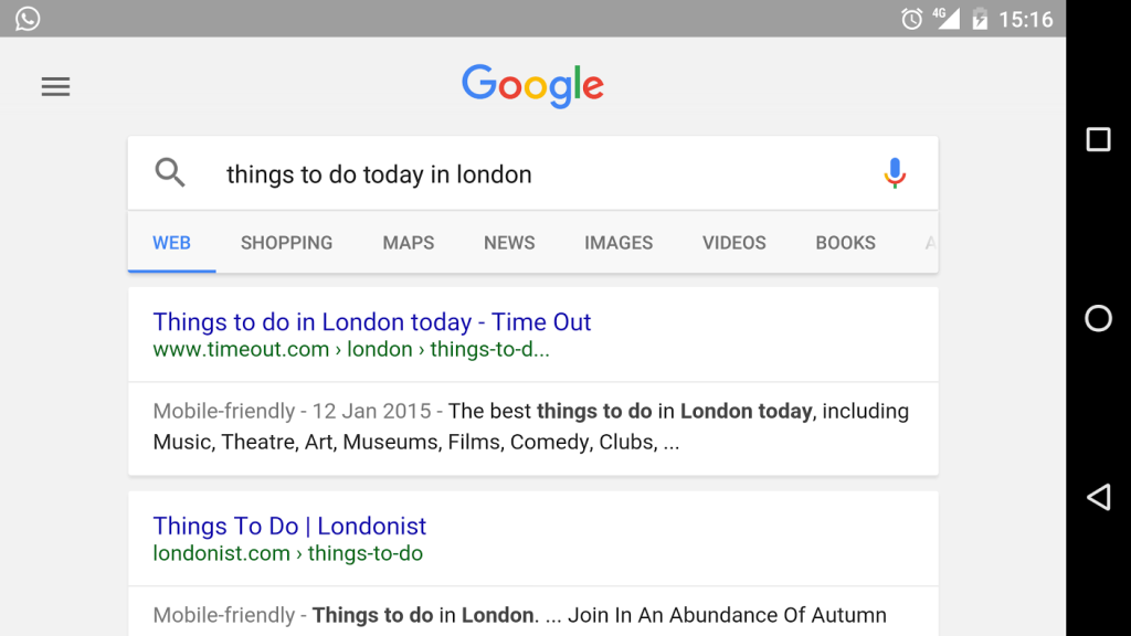
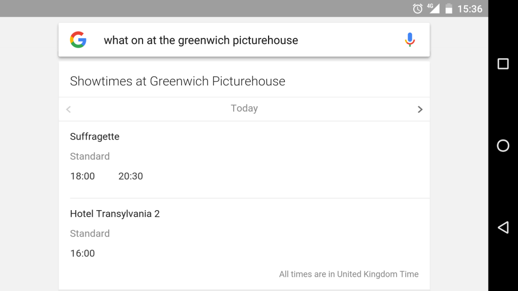
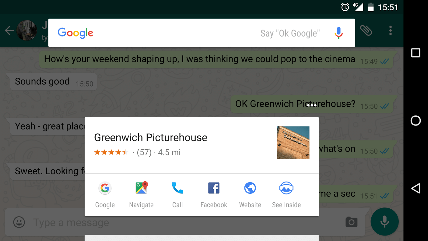
In many search scenarios, your mobile device uses signals like your location and current activity to improve search result quality. Your queries can be chained in compound, to derive more insight into the searcher’s intent. The results themselves can make app suggestions in the search results pages (via app indexing, provide data from apps in Cards or display apps running in the cloud that are not installed on your device but run virtually.
The actions we took in the scenario earlier, such as “OK Google: send a WhatsApp message to Jon” are a result of an ongoing and fast evolving process of integration between apps and the Google Now API.
Think about all of the possible touch points a user might have with search via mobile. Then, compare those thoughts with your understanding of the more conventional use cases we see when users engage in a desktop search. Essentially, mobile can respond, suggest, predict and fulfil search queries in a way that desktop simply cannot.
Obviously, there are similarities between the two mediums. “Desktop SEO” and “Mobile SEO” are not entirely dissimilar practices, although mobile does require a seriously up to date skillset and a solid understanding of mobile browser performance, mobile site speed and responsive web development, on top of all the SEO basics.
The future of search is mobile, but mobile expands well beyond mobile SEO.
Entrance points to attaining better brand awareness such as Google Now, Google Now on Tap, Answers suggested in Google Suggest or Organic referrals directly to apps make “classic” organic search on a mobile device only one of many tactics that need exploration.
Firstly, the statistics
The percentage share of “Mobile” search (desktop vs mobile May 2015) has finally surpassed Desktop. This means your mobile strategy is at least as important as desktop. Because of the emerging variation between mobile and desktop strategy, we think mobile and desktop should be considered entirely different channels.
According to this recent Wall Street Journal article covering data provided by Comscore, “the overall time spent online with desktop devices in the U.S. has remained relatively stable for the past two years. Time spent with mobile devices has grown rapidly in that time, but the numbers suggest mobile use is adding to desktop use, not subtracting from it.”
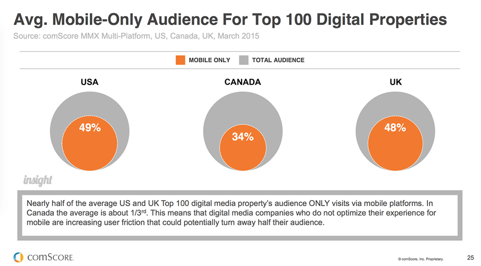
In this data from comscore, nearly half of the average US and UK Top 100 digital media properties audience only visits via mobile platforms. In Canada the average is about 1/3rd. This means that digital media companies who don’t optimise their experience for mobile are increasing user friction that will undoubtedly erode their audience.
Always proceed with caution on mobile growth statistics, though.
“Amit Singhal, Google’s head of search, let slip a couple of interesting statistics at the Re/Code conference – none more so than that more than half of all searches incoming to Google each month are from mobile. (That excludes tablets.)
This averages out to less than one search per smartphone per day.”
As with all new technologies, there are heavy user demographics and light user demographics. Consider your targeting carefully.
If you’re seeking the best potential revenue gain on both platforms, consider mobile and desktop search separately, but don’t prioritise one over the other. For now don’t assume that one will replace another. Find a strategy that works for your brand and respects both desktop and mobile as valuable, different sources of traffic.
Mobile is here, it’s growing and in many cases, it’s a more complex and diverse medium than desktop. Put simply, the search experience on mobile is richer than its desk bound counterpart. Why?
Signals: The Depth of Search Signals Derived from a Mobile User’s Activity
Google’s mission is to present the best and most meaningful search results for its users. Google achieves this by listening for the signals you emit without realising. Many of the search signals available to your device (and subsequently, the search engine) are unique to you at the time the search is executed. These signals can make the search experience much richer. Some signals are explicit; you have specified exactly what you’re looking for via an action, like a voice search or keypad. Other signals though are implicit; device type and location, for example. It’s implicit signalling that sets desktop and mobile search apart:
- Query (explicit) : “nearest tube station to Jamie’s Italian”
- Location (implicit) : “Trafalgar Road, Greenwich, London”
- Device : “Android, Marshmallow”
- Activity : (walking, running, driving)
- App usage / apps installed / custom voice actions
- Your browser history (see more)
- Your search history (from all chrome devices not just the phone)
Google explains how Google Now cards work and categorises these signals more broadly into 3 types. The user has control of the settings described below, although many of them, such as location, tend to be activated during Android set-up and then largely forgotten.
Web & App Activity:
“May include your searches, Chrome history, and activity shared by other apps. When this setting is on, you can see Google Now cards based on things you searched for in the past, like your favourite sports team or TV show.”
Device Information:
“Allows Google to know information about your phone, including things like lists of your contacts, calendar entries, apps, and more.”
Location History:
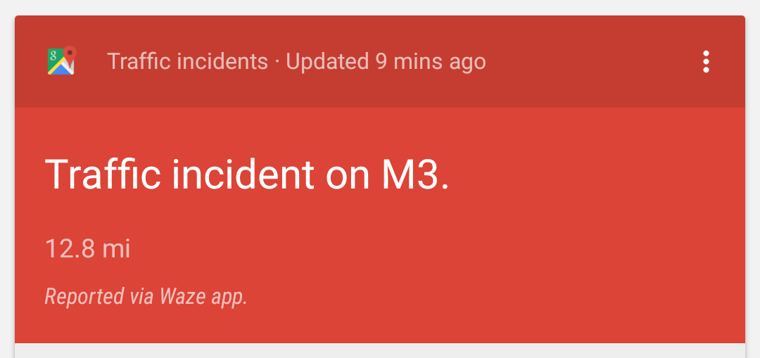
“Creates a map of the places you visit when you’re logged in to your device. When Location History is on, you’ll see Google Now cards that are relevant to the area you’re in, like traffic updates and nearby restaurants.”
If you’d like to see the location history Google is storing, go to the Google Maps location history page: https://maps.google.co.uk/locationhistory/b/0
When Might a User Interact with Your Brand via Mobile
So now we understand how Google may enrich the search experience with signals derived from your device, what precisely does that experience look like?
Across Google’s mobile ecosystem, there are many touch points between your brand and a user. Traditionally, Google’s organic search results would have been the primary traffic driver. That may still yet be true for mobile, but there are many other diverse ways in which a visitor could first discover your content.
Google Organic Search
- “Classic” mobile search results
- App suggestions via App indexing:
- App actions (apps installed on your device suggested in search results):
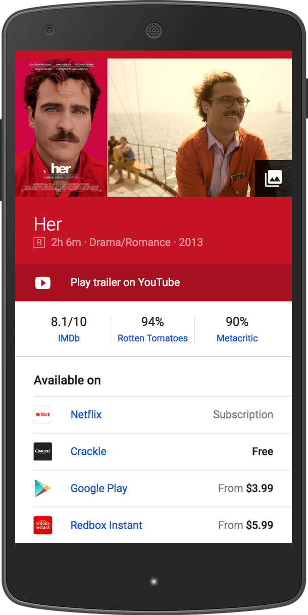
- App results (brand search)
- “Classic” Organic features: local, news, image, in-depth articles, Knowledge Graph
Google Now:
- Cards (articles & content – based on your browse history and similar sites)
- Cards (“Stories to Read” – news stories based on news searches and direct to site visits from browser or other apps)
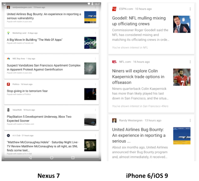
Source: Marketing Land
- App integration cards: Spotify, Trulia, Feedly, Skyscanner and more
Google Now On Tap
- Analyses the content on your screen and instantly searches for relevant context and data that could be useful
Actions

Mobile SEO
Mobile Site Configuration
There are three mobile configuration options to choose from, each with their own considerations for both users and SEO – they are:
- Standalone mobile site – typically an m. subdomain or /m/ sub directory
- Dynamic serving of content / adaptive – serving different HTML & CSS depending on the device making the request on the same URLs
- Responsive design – same HTML is served for each device, but rendering is made more compatible by CSS
1. Standalone Mobile Site
The main issue with housing the mobile version of your site on separate URLs is that it usually requires a lot more resource to optimise, and can add layers of complexity when dealing with an international, multilingual website.
Without the correct annotations search engines will consider this content as either part of the desktop site (if located in a /m/ sub folder) or a separate site completely.
However, once you’re in a position where the site has been setup, the framework does offer greater flexibility as you’re not tied down by the desktop code.
1.1 Creating a Relationship between Desktop & Mobile
In order to show the relationship between the desktop and mobile sites, search engines rely on the use of rel=”canonical” and rel=”alternate”.
For every page on the desktop site, rel=”alternate” should be added referencing the equivalent page on the mobile site (but only if there is a direct equivalent).
For every accessible page on the mobile site, rel=”canonical” should be added pointing back to the equivalent page on the desktop site.
For example:
https://builtvisible.com/mobile-seo-guide/
Should contain the following reference:
<link rel="alternate" media="only screen and (max-width: 640px)" href="https://m.builtvisible.com/mobile-seo-guide/">
And on https://m.builtvisible.com/mobile-seo-guide/
<link rel="canonical" href="https://builtvisible.com/mobile-seo-guide/">
These can instead be added to the XML sitemaps, like so:
<?xml version="1.0" encoding="UTF-8"?>
<urlset xmlns="https://www.sitemaps.org/schemas/sitemap/0.9" xmlns:xhtml="https://www.w3.org/1999/xhtml">
<url>
<loc>https://builtvisible.com/mobile-seo-guide/</loc>
<xhtml:link rel="alternate" media="only screen and (max-width: 640px)" href="https://m.builtvisible.com/mobile-seo-guide/" />
</url>
</urlset>
1.2 XML Sitemap, Robots.txt & WMT
Just like the desktop, the mobile site should also consist of its own XML sitemap to improve page discovery & indexation. This in turn can then be submitted to Google’s search console with the m. or /m/ directory verified as another site, which will also give you greater insights into issues encountered and crawl behaviour specifically for the mobile site.
Similarly, if the site is on a subdomain a separate robots.txt file may be necessary in order to better conserve crawl budget.
1.3 Redirection
Providing that the rel=”canonical/alternate” tags are correctly in place, 301 & 302 redirection is supported, along with bidirectional & unidirectional redirects to and from the mobile site.
However, it’s advised that users have the option of accessing both versions should they wish, for example a link in the footer of the mobile site to view the full (desktop) site, and vice versa.
The redirects should only be deployed for URLs where a direct/near equivalent is available to avoid it being classed as a ‘faulty redirect’. Search engines view this type of behaviour as a poor experience for its users, so it’s likely baked in to the algorithm.
The redirects can be tested by tools like Screaming Frog that allow you to switch your user-agent and crawl accordingly to check behaviour on each device.
2. Adaptive
As different CSS & HTML is served on the same URLs depending on the type of device making the request, the only key consideration here is making search engines aware of this configuration.
2.1 Vary HTTP Header
This is done via the use of the Vary HTTP server header response that informs search engines that the content of the page changes depending on the type of user-agent making the request.
For example:
GET /mobile-search-guide/ HTTP/1.1
Host: builtvisible.com
...
HTTP/1.1 200 OK
Server: nginx
Content-Type: text/html
Vary: User-Agent
...
Providing search engines are seeing the same result as a typical user for each device, your mobile site will be crawled and indexed correctly.
3. Responsive Design
This is the recommended approach by Google as the same HTML is served regardless of device at the same location. With no redirects or signals (rel=”canonical/alternate”) involved it reduces the risk of accessibility issues, and therefore is more reliable for general users.
3.1 Blocked Resources
One requirement of this set up (albeit also advised for the other two configurations) is to ensure that all CSS, JS and Image files are fully accessible and not blocked by robots.txt so that pages are rendered correctly.
3.2 Meta Viewport
You’ll also need to inform browsers that the content of the page adapts to all devices, so the content can be resized appropriately. This is done by adding the following Meta viewport:
<meta name="viewport" content="width=device-width, initial-scale=1.0">
3.3 Image Scaling with Srcset & Sizes
The image attributes srcset & size can improve performance on mobile devices by informing the browser of a range of resources available for each image, depending on the size of the viewport will then depend on which of these resources is served.
This replaces the tendency in responsive design to use a single larger image that is rendered fully regardless of device and then scaled accordingly by the browser.
The code for this would look something like:
<img src="https://builtvisible.com/wp-content/uploads/2015/09/curiosity-medium.jpg" alt="Mars Curiosity Rover takes an excellent selfie." srcset=" https://builtvisible.com/wp-content/uploads/2015/09/curiosity-large.jpg 1120w, https://builtvisible.com/wp-content/uploads/2015/09/curiosity-medium.jpg 720w, https://builtvisible.com/wp-content/uploads/2015/09/curiosity-small.jpg 400w" sizes="(min-width: 40em) calc(66.6vw - 4em) 100vw">
General Optimisation
There are a number of other mobile considerations that affect both usability and search engines’ ability to crawl & render pages. The majority are also flags in both Google’s & Bing’s mobile testing tools, these include:
- Scaling content to viewport – use relative width values in CSS to ensure that page content scales appropriately based on the device viewport (see point 3.2 above).
- Readable text – with the viewport affecting how fonts are scaled on mobile devices, the only other recommendation is to use a default line height of 1.2em.
- User friendly touch elements and links – ensure primary touch points on mobile have a min height/width of 48 pixels. Secondary links can be smaller providing there are no other touch points within a proximity of 32 pixels (or 5mm).
- Unplayable content – avoiding for example, flash based content that cannot be rendered by most mobile browsers.
- Interstitials – avoid using interstitial popups that may advertise or encourage an app install. These features offer a poor user experience, slow page load and because of recent changes to Google’s mobile algorithm, is not considered mobile friendly.
Testing
Tools for the job:
- Mobile Friendly Testing Tool – Google’s own mobile testing tool that checks for numerous accessibility issues for both users and search engines.
- Mobile Usability Report – the mobile usability report in Search Console will highlight sitewide mobile accessibility issues.
- Fetch as Google – another report in Google’s Search Console that allows you to view how different Googlebot user-agents render mobile URLs.
- Mobile Friendliness Test Tool – Bing’s equivalent mobile testing tool.
- Screaming Frog – desktop software that allows you to crawl a site or group of URLs with different user-agents including search engines and mobile devices. Export and compare the results against a desktop crawl, or even just troubleshoot directly from the mobile data.
- Deep Crawl – similar to SF, but accessible online and typically better suited for significantly larger websites for on-going reporting & maintenance.
- User-Agent Switcher – Chrome / Firefox – allowing you to spoof your user-agent directly in the browser.
- W3C Mobile Checker – similar to the W3C HTML validator, but more visual and informative.
- BrowserStack – useful for design & build purposes.

App Indexing
App indexing allows Android & iOS app content to be surfaced directly in search results in Google & along with Windows apps in Bing, generally alongside your web-based content for increased organic real estate:
There are some distinct differences between how Google & Bing use deep links, and so the following sections have been split accordingly…
1. Google
If a user has already downloaded an app and then carries out a related search in Google, the content within the app itself can appear as an option within auto complete to increase the likelihood of re-engagement.
As mentioned previously, this information can also be surfaced when using Google Now on Tap. This feature scans the current screen and then searches Google for contextually relevant content, demonstrated in this video from Search Engine Land.
Google is also starting to experiment with displaying app-only content in its search results, whereas currently apps would only be surfaced if a web presence also existed. In order to do so Google relies on the integration of the App Indexing API, and is currently working with a number of select partners to refine & test this process.
Another new feature being tested is Google’s ability to stream apps in the Cloud that haven’t been installed on a user’s device. This allows users to fully interact with apps without the need to download which could impact app re-engagement and businesses generally. Preview below from TechCrunch:
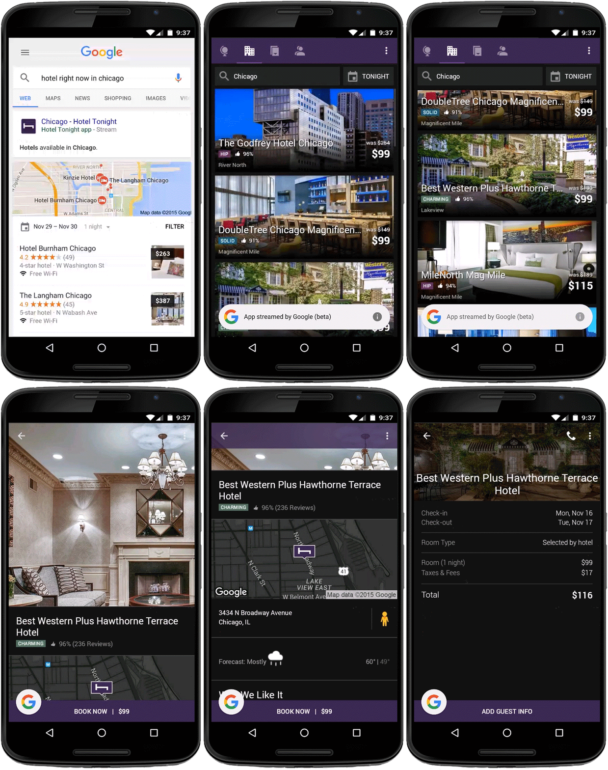
Before any of this can be accomplished your app needs to be first made dishverable & indexable.
1.1 Getting Your Android App Indexed
1.1.1 Enabling App Deep Links with Intent Filters
Deep links enable a relationship between your web-based content and in-app content to be recognised & understood by Google, so that when a user searches on an Android or iOS device this content can also be surfaced in search results. This in turn offers a greater user experience by providing users with the option to interact and download related apps or continue to view the mobile website.
In order to enable deep links you’ll first need to set up intent filters, which will tell your app how to respond to requests from the Android browser or Google’s search app. These filters are added to your androidmanifest.xml file, and include the following key properties:
<action> – with the ACTION_VIEW attribute allows the intent filter to be reached from Google search by informing Android that this is an entry point to the app.
<data> – these tags define what URI formats are accepted in order to resolve an activity. For multiple formats a new intent filter should be created i.e. if both https://example-app.com and example-app:// are to be supported, then you’ll need two intent filters.
<category> – defines different activities:
- BROWSABLE – required in order for the intent to be executed from a web browser, email client etc.
- DEFAULT – only necessary if you need the app to accept an implicit intent.
Example intent filter using https://example-app.com & example-app://
<activity android:name="com.example-app.android " android:label="@string/title_recipe">
<intent-filter android:label="@string/filter_title_viewtopic">
       <action android:name="android.intent.action.VIEW" />
       <category android:name="android.intent.category.DEFAULT" />
       <category android:name="android.intent.category.BROWSABLE" />
       <data android:scheme="example-app" android:host="topics" />
     </intent-filter>
     <intent-filter android:label="@string/filter_title_viewtopics">
         <action android:name="android.intent.action.VIEW" />
         <category android:name="android.intent.category.DEFAULT" />
         <category android:name="android.intent.category.BROWSABLE" />
         <data android:scheme="http"
               android:host="example-app.com"
               android:pathPrefix="/topics" />
     <intent-filter>
</activity>
1.1.2 URL Config for App Indexing
The URL format is made up four main segments:
- Protocol
- Package ID
- Scheme (HTTP or custom)
- Host Path
Which translates to:
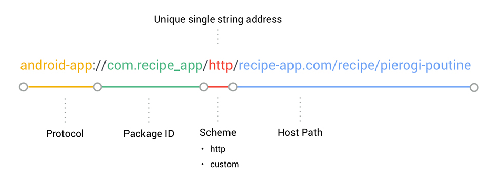
These URLs can then be referenced on your website in order to establish the relationship with in app content
- XML Sitemaps
- Page level rel=”alternate”
- Schema.org
1.1.3 Applying Deep Links to Your Site
Connecting Your App & Site in Search Console At this stage, this alone will be enough for Google to start crawling and indexing your app content but it leaves a lot open to Google’s interpretation. XML Sitemaps Within each set of <url></url> tags in the XML sitemap a reference can be added to signal the corresponding page within the app (which is the same format for iOS content):
<xhtml:link rel="alternate" href="[deep link URL]" />
Full example below:
<?xml version="1.0" encoding="UTF-8" ?>
<urlset xmlns="https://www.sitemaps.org/schemas/sitemap/0.9"
 xmlns:xhtml="https://www.w3.org/1999/xhtml">
<url>
  <loc>https://example-app.com/topic</loc>
  <xhtml:link rel="alternate" href="android-app://com.example-app.android/topic" />
</url>
</urlset>
Page Level References
These references can instead be added at a page level on your website using the <link> property within the <head> of the HTML, for example:
<link rel="alternate" href="android-app://com.example-app.android/topic" />
This too is supported for iOS apps.
Schema.org Markup
As a further option these can also be added at a page level with schema.org markup in JSON-LD format:
<script type="application/ld+json">
{
  "@context": "https://schema.org",
  "@type": "WebPage",
  "@id": "https://example-app.com/topic",
  "potentialAction": {
    "@type": "ViewAction",
    "target": "android-app://com.example-app.android/http/example-app.com/topic"
  }
}
</script>
1.1.4 Noindex App Content
In some scenarios you may want to prevent Google from indexing some of the content within your Android app. This is possible by creating a noindex.xml file which can include noindex directives for a particular page (uri) or group of deep links based on a prefix (uriPrefix):
<?xml version="1.0" encoding="utf-8"?>
<search-engine xmlns:android="https://schemas.android.com/apk/res/android">
<noindex uri="https://example-app.com/topics/noindexed-page"/>
<noindex uriPrefix="https://example-app.com/topics/all-sub-urls/"/>
</search-engine>
Once created the noindex.xml file will need to be referenced in the AndroidManifest.xml file:
<meta-data android:name="search-engine" android:resource="@xml/noindex"/>
1.1.5 App Indexing API
Part of the Google Play Services, the App Indexing API enables your app to appear in the auto complete feature described earlier, whilst enabling Meta data such as titles to be added to app views. This is a core requirement if you’re looking to get app-only content indexed in Google.
You’ll first need to ensure your app is using the Google Play services, adding the following to the AndroidManifest.xml file:
<meta-data android:name="com.google.android.gms.version" android:value="@integer/google_play_services_version" />
Google’s instructions here describe a common workflow and more details on returning associated metadata & actions for each activity supporting deep links.
For a more complete tutorial on connecting to the App Indexing API take a look at code labs’ walkthrough that includes a full sample app to work with.
1.1.6 Testing
This configuration can be tested using the following methods:
- Android Debug Bridge
- Deep link testing tool (using QR codes)
- Search Console’s ‘Fetch as Google‘ and ‘Crawl Errors‘ report
1.2 Getting Your iOS App Indexed
1.2.1 Enabling Universal Links (HTTP Deep Links)
Google supports the use of HTTP URLs for app indexing in iOS 9 which are a native feature of Apple’s universal links. In order to get set up you’ll first need to adopt the UIApplicationDelegate methods so that your app understands how to handle these links, then associate your app with a domain(s).
To connect your domain and apps you’ll first need to add an entitlement file to your XCode that lists all associated domains. A site association file will then need to be created and hosted at a root level for each connected domain.
For more details on setting up universal links see Apple’s developer guidelines.
1.2.2 App Indexing (Registering Your iOS App)
Google’s app indexing requires that you install the Google SDK via CocoaPods in order to register your app, details of installation of which can be seen here.
Once installed you’ll need to add the below to the Podfile in order to pull the App Indexing dependencies:
pod 'GoogleAppIndexing'
This is then installed using the below command to create a blank workspace:
pod install
At the top of the AppDelegate class add the following:
#import <GoogleAppIndexing/GoogleAppIndexing.h>
And finally in the application:didFinishLaunchingWithOptions method add:
[[GSDAppIndexing sharedInstance] registerApp:iTunes ID];
Google will then locate the URLs in the association file and start indexing your iOS content.
Your universal links can be tested simply by tapping a link in Safari iOS 9 and verifying that the correct content within the app has been returned.
1.2.3 Mapping Your Deep Links
To assist Google with the discovery of your app content you should still map your deep links as described in point 1.1.3 just switching or adding the unique reference for the iOS app e.g.
ios-app://000000/example-app/topics
1.3 App Indexing Considerations
- Adopt a first click free approach, avoiding interstitials that degrade user experience and can lead to issues during crawl.
- Ensure access has been granted to your app content in robots.txt.
- Google recently announced increasing support for app-only content in its search results, as currently only apps with a web equivalent are featured. This is still in an experimental phase with a select handful of apps but likely to roll out in the not too distant future. There is however a Google form allowing developers who are currently working with app-only content to get in touch and express your interest in this new approach.
2. Bing
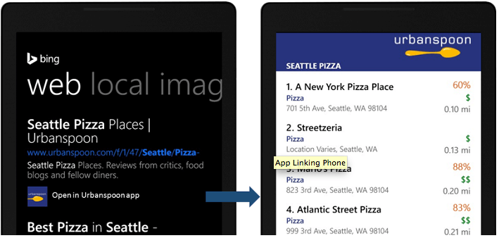
Bing is undergoing some big changes in the mobile space this year. They announced earlier that they were building an index of app content & actions for iOS, Android and Windows 10 apps based on https://applinks.org/ & schema.org actions specifically, which will eventually roll out into search results.
At the same time applinks.org already provides an enhanced user benefit by allowing apps to communicate with each other to understand a series of potential actions. This diagram more accurately highlights how App Links work:
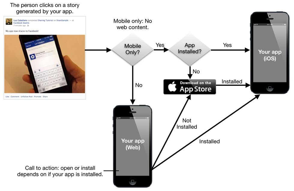
Source: Facebook Developers
Bing also recently released ‘Snapshots’ on Android, which in its simplest form replicates the functionality seen in Google Now on Tap, surfacing yet more contextually relevant content.
Just like Google, in order to capitalise on the changes to mobile that Bing brings we first need to ensure that your apps are getting crawled & indexed. With the use of applinks.org, this applies to Windows, iOS and Android apps.
2.1 App Linking (Indexing)
2.1.1 Integrating App Links into Your Site
Applinks.org is an open standard for publishing deep links on your website, and is a case of adding a series of Meta tags within the head of the HTML specifying details for each platform (or even device).
The properties of the required Meta data are unique for each platform but tend to comprise of the following 3 components:
- URL
- App store ID
- App name
These components are then featured as a property in the Meta data in the format below:
al:platform:component
So for example:
al:ios:url
al:ios:app_store_id
al:ios:app_name
And the full output will look something like:
<html>
<head>
    <meta property="al:ios:url" content="applinks://docs" />
    <meta property="al:ios:app_store_id" content="12345" />
    <meta property="al:ios:app_name" content="App Links" />
    <meta property="al:android:url" content="applinks://docs" />
    <meta property="al:android:app_name" content="App Links" />
    <meta property="al:android:package" content="org.applinks" />
    <meta property="al:web:url" content="https://applinks.org/documentation" />
</head>
Please refer to the full property list here.
This output can go far beyond specifying related mobile app content to Bing for use in its search results. It can be used to manage version control to better serve users on older devices, offer a fallback if an app isn’t installed, or better communicate between other apps to serve content. Check here for a more detailed list of example use cases.
2.1.2 Handling App Communication
The next part requires handling the App Link navigation protocol which is device dependent. The documentation for this is already vast and so we’re just going to help point you in the right direction from here.
For more details on each platform see the following links:
The following resources & repositories will further aid during this process:
Bing also provide a mark-up tester specifically for analysing your App Link data.
2.1.3 Connected Pages
To further highlight the relationship between apps and a single domain, you can now add your Android & iOS apps (along with Windows) to the Connected Pages tool in Bing Webmaster Tools.

App Promotion
There are a number of ways you can increase the visibility of your app or website on mobile devices outside of App Indexing & ASO (app store optimisation) to improve overall re-engagement, these include:
1. Schema.org Actions
Schema.org already plays a massive role in search, from influencing the appearance of your site in search results, to providing more information surrounding specific entities or answers to questions. We know that this is also used as a mechanism for surfacing pieces of content to satisfy a query relating to a direct user action such as listening to a piece of music, or watching a specific video.
On mobile this translates to another opportunity because this space can also be populated with related app content:
Source: Justin Briggs – Mobile App SearchSchema.org Action mark-up enables your app content to be promoted in Knowledge Graph and appear in search results. The current supported actions by Schema.org are as follows:
- AchieveAction
- AssessAction
- ConsumeAction
- ControlAction
- CreateAction
- FindAction
- InteractAction
- MoveAction
- OrganizeAction
- PlayAction
- SearchAction
- TradeAction
- TransferAction
- UpdateAction
Markup is then added to a corresponding web page that in turn references the related page within the app, so we end up with something like:
<script type="application/ld+json">
{
  "@context":"https://schema.org",
  "@type":"MusicGroup",
  "url":"https://www.example.com/artist/Katy-Perry/",
  "name":"Katy Perry",
  "sameAs":"https://www.katyperry.com",
  "description":"Katy Perry is a pop music artist.",
  "potentialAction":{
    "@type":"ListenAction",
    "target":[
      {
        "@type":"EntryPoint",
        "urlTemplate":"https://www.example.com/artist/Katy-Perry/?autoplay=true",
        "actionPlatform":[
          "https://schema.org/DesktopWebPlatform",
          "https://schema.org/IOSPlatform",
          "https://schema.org/AndroidPlatform"
        ]
      },
      {
        "@type":"EntryPoint",
        "urlTemplate":"android-app://com.example.app/examplescheme/artist/Katy-Perry/?autoplay=true"
      }
    ],
    "expectsAcceptanceOf":{
      "@type":"Offer",
      "eligibleRegion":[
        {
          "@type":"Country",
          "name":"US"
        },
        {
          "@type":"Country",
          "name":"BR"
        }
      ]
    }
  }
}
</script>
2. Google News
If you’re a publisher with an Android or iOS app, these can also be submitted to Google News directly to help surface your apps in search results:
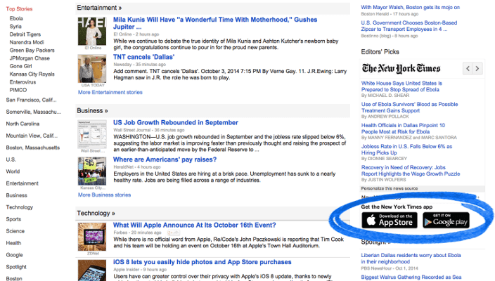
Head over to the Google News Publisher Centre, ensure that your Editors Feed has first been added and then within ‘Mobile’ from the left hand navigation pane add links to both your Android & iOS apps.
3. iOS Smart Banners
Safari in iOS supports the use of ‘Smart App Banners’ that allow users to view and download a related app directly from the browser when prompted:

These banners will appear at the top of pages that feature the following Meta tag in the head of the HTML:
<meta name="apple-itunes-app" content="app-id=myAppStoreID">
4. Chrome – Add to Home Screen
Android supports the ability to add a link to a website from the home screen, with the link itself appearing visually similar to native installed apps. The appearance of this can also be customised so that it looks more like a traditional app than the standard icon generated using this process.
These links are also navigable using Android’s task switcher, again making it feel more like a traditional app.
In order to enable this experience, we link to a manifest file within the HTML <head> of your website e.g.
<link rel="manifest" href="manifest.json">
The manifest file can then contain the following properties:
- A customised app icon & label
- Display – determines how the app will be displayed. This can be set to either fullscreen, standalone, minimal-ui or browser.
- Start URL – the URL opened when the app/link is launched.
- Orientation – sets the default orientation for the app.
- Related_applications – used to define the relationship to other full apps on Android or Apple devices. Also leads to the generation of native app install banners.
The full property list can be seen here.
Example manifest file:
{
  "name": "Google I/O 2015",
  "short_name": "I/O 2015",
  "start_url": "./?utm_source=web_app_manifest",
  "display": "standalone",
  "icons": [{
    "src": "images/touch/homescreen48.png",
    "sizes": "48x48",
    "type": "image/png"
  }, {
    "src": "images/touch/homescreen72.png",
    "sizes": "72x72",
    "type": "image/png"
  }, {
    "src": "images/touch/homescreen96.png",
    "sizes": "96x96",
    "type": "image/png"
  }, {
    "src": "images/touch/homescreen144.png",
    "sizes": "144x144",
    "type": "image/png"
  }, {
    "src": "images/touch/homescreen168.png",
    "sizes": "168x168",
    "type": "image/png"
  }, {
    "src": "images/touch/homescreen192.png",
    "sizes": "192x192",
    "type": "image/png"
  }],
  "chrome_related_applications": [{
    "platform": "web"
  }, {
    "platform": "android",
    "location": "https://play.google.com/store/apps/details?id=com.google.samples.apps.iosched"
  }]
}
5. Service Workers
Finally, no consideration of the mobile web’s future would be complete without a discussion of Service Workers. To be clear, this API is not yet ready for prime time. It does, however, have the potential to bring the rich offline experiences offered by native apps – background sync, push notifications, and so on – to the web.
Service workers are JavaScript files run by a browser in the background, used to control the web page or site they are associated with. They act like proxy servers on the client side, intercepting requests and taking various actions depending on whether network access is available or updated resources are present on the server. The implications of this technology are huge; service workers have the potential to close the gap between native apps and the mobile web.
A good introduction is available over at HTML5 Rocks. Service workers are under active development by browser vendors, and you can check out cutting-edge implementations on nightly builds of Firefox or on the Canary release channel of Chrome. Undoubtedly one to watch for 2016.

Mobile First: Content Development for Mobile Marketers
Mobile User Experience
The challenge with development of mobile content is that it’s often approached with content that’s designed for desktop first, and even when mobile is the primary form factor, mobile-first design is a non-trivial concern.
If we think about some of the best designed apps on mobile, software like Spotify, Inbox and Instagram, there are some common themes. These all, in their mobile app forms, take great pains to respect what a mobile device is, and to deal with the user appropriately.
This comes primarily from an understanding of two things: the underlying architecture of the data and system they’re dealing with, and an appreciation of the necessary interactions. Let’s take Inbox as an example. From the initial screen, there’s a few basic actions that the user might want to take:
- Viewing their mail (both in list and specific item forms)
- Composing a new mail
- Searching existing mail
- Navigation to a specific folder
I’ve put these in the order of estimated likelihood of use. As a result, the prominence of the UI elements on the display should reflect this, and indeed we can see this is the case:
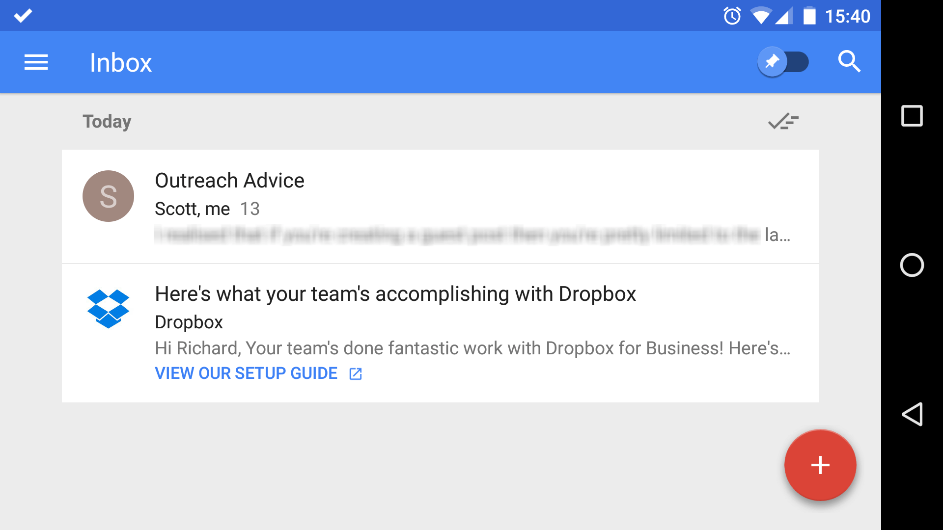
Almost all of the screen is used to display the current messages, with a button acting as a quick link to the compose item screen, a link to search less prominently placed in the top navigation at the right, and all the folders hidden off-screen.
However, this is all contextual. If you clicked on the compose button, the desired actions you’d wish to be able to take from the next screen might be different. As a result, everything on the screen is devoted to giving a great experience of composing the email, with the actions put all in the top bar (send mail, attach a file, and close the editor). There’s no way from here to search messages, jump to other folders and so on. There isn’t room to put those somewhere that it wouldn’t be distracting, so they’re not included.
It’s this understanding of what the app can do, what it needs expose from that list right now, combined with a ruthlessness in design elements which is required for successful execution on mobile.
The difficulty comes in knowing how to apply this to a piece of content you’re developing, which probably isn’t an app.
Mobile Content UX
We, as marketers, tend to commission content that could loosely be described as single page apps (SPAs). By this, often we mean standalone content, existing on a single URL, with interactive components. Things like the Piaget Altiplano 900 page, Homan Square and Inside Abbey Road. The way we enable people to interact with these kinds of content is no different to how we should consider interaction with a native app. Essentially, the same considerations apply:
- From any screen, what actions would a user wish to take?
- What’s the most vital engagement for a user on that particular screen?
Note the usage of the word screen; it’s helpful to think of content for longer or more involved pieces in terms of screens, rather than pages. What’s in the specific view the user is presented with right now?
Take “Inside Abbey Road” as an example.
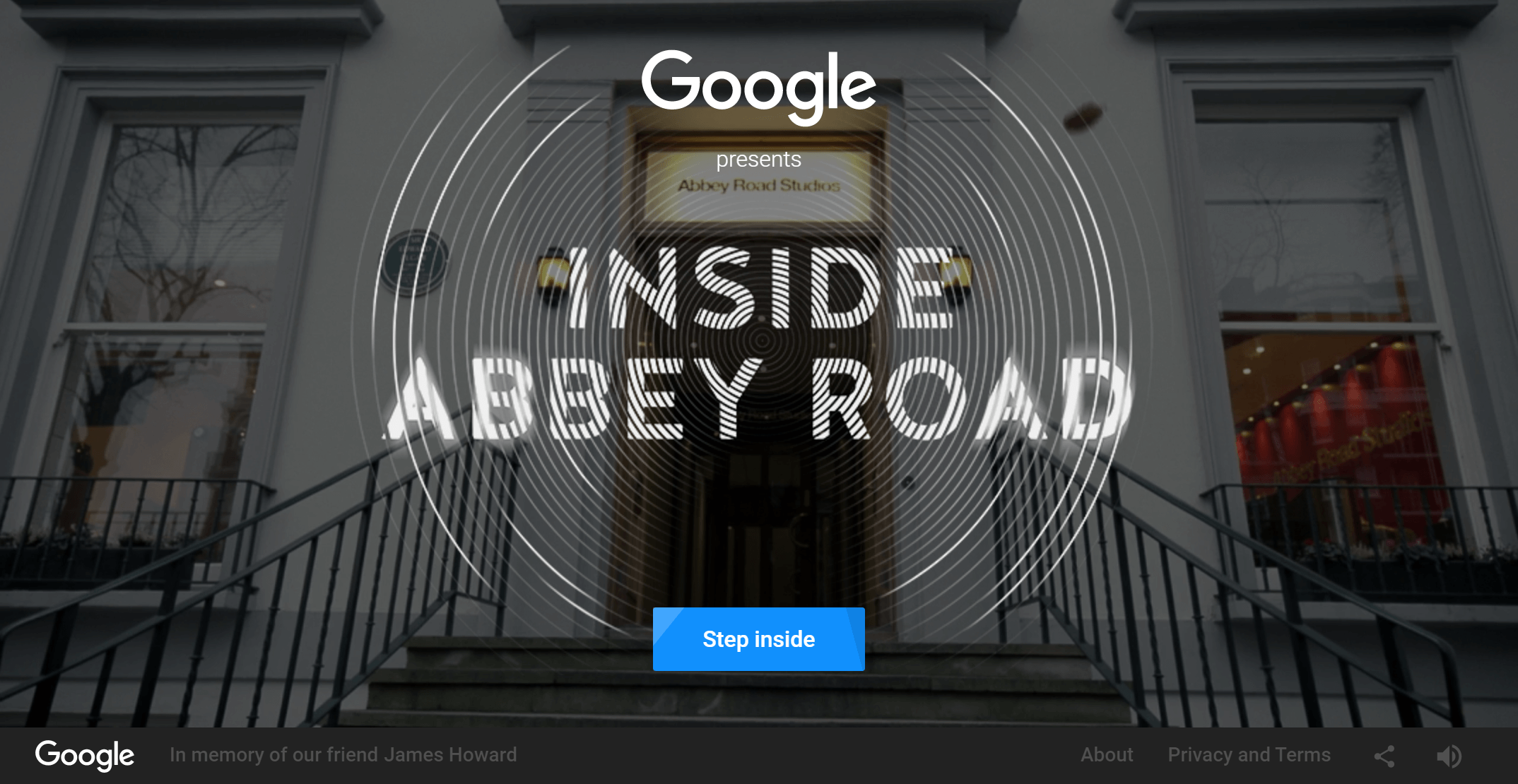
Desktop
We load the page, and we get some text to talk us through what we’re being presented with and set the stage. There’s a single action once that’s done – navigate to the main page. From there, we need to be presented with actions to take us to specific content. That’s done through some hoverable labels, which we can click to move to a section and then interact with more specific content.
Mobile
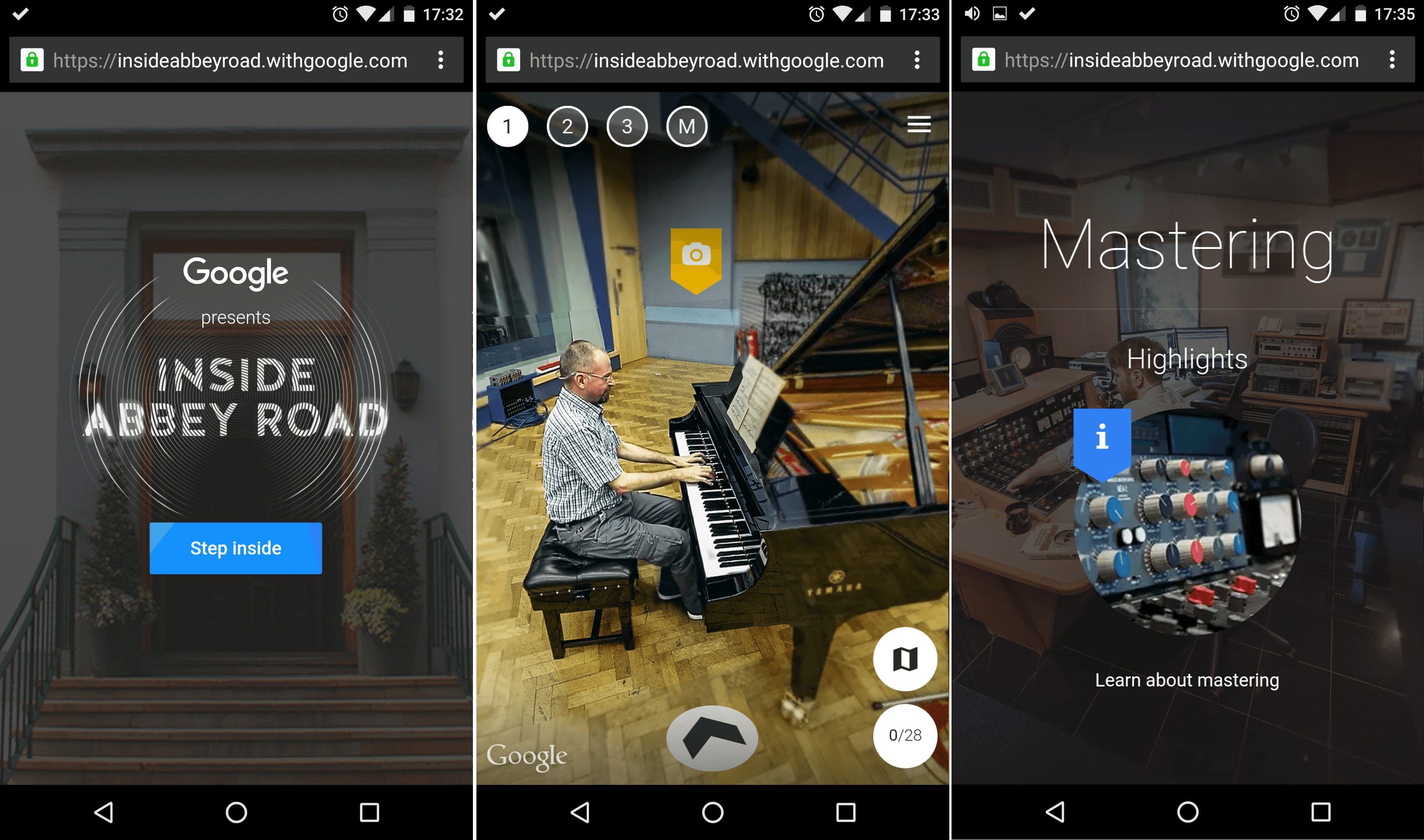
Here we skip the introduction, and instead jump straight to the single action button to navigate to the main content. From there we’re shown the “inside the hall” screen, which we navigate naturally using streetview style press and drag motions. The clickable items now become touch activated, expanding on click, and then taking us to the next screen on a second click.
Same Content, Interactions Unique to the Screen
In both these cases, we’re presented with the same content, but the interaction feels more natural on touchscreens, where the click and drag effect feels more intuitive, whereas doing the same on a desktop with a mouse feels less natural. However, the expanded map view works more fluidly on the desktop. On mobile, the Gyroscope feature lets you move your phone to look around the room, which obviously isn’t even shown as a possibility on desktop. The key though is that in both cases, the interactions available work well, and present actions that make sense on the screen you’re looking at.
For example, once we’ve moved onto a single item, we’re shown a top navigation which has the share action button and close buttons to navigate back to the previous screen at the top. On the other hand, on the “inside the hall” screen, we get to see quick links to the different studios, and other navigation options.
Throughout the app, the navigation and interaction points are thought out and well presented, designed to offer what you need now, whilst not distracting from the overall experience. It’s a level of consideration not always given to content that makes the overall experience far more engaging and impressive.
Finally, the app shows as much information as is required at any time, no more and no less. This is an important point to take home; be willing (and confident enough) to communicate a simpler level of interaction with the data. Often you’ll find that less is more, and with a more meaningful experience often comes vastly greater social success.
To get the same results with your own content:
- Think of your content in terms of screens, not pages. What’s visible right now, and what actions should be usable at this current point?
- Only show the absolute minimum navigation and interaction points necessary, rather than the most that you can. Consider what’s required and only put those things on the page. Anything of secondary importance can be put off-screen, or on a sidebar on larger screens.
- Build a functional prototype, with no design or transitions/animation etc first. Design makes the experience of using the content beautiful, but prototyping makes it possible.
- Test the prototype actions for usability. Only when it works at this level is it suitable to go to design.
- Sweat the details of design. Content lives or dies by how good it looks, as well as how effectively it delivers information.
- Ensure that the experience is at least as good on desktop as on mobile, if there’s a chance people will share it. The web still has a lot of desktop users as well.

Resources
- Smart Insights’ mobile marketing statistics compilation
- Adwords Building for the next moment
- Google voice actions
- Mobilegeddon or: How I Learned to Stop Worrying and Love Our New Mobile World
- Reinventing Google for a Mobile World
- How to Implement Person and Organisation Schema in JSON-LD in WordPress
- App Indexing & The New Frontier Of SEO: Google Search + Deep Linking
- App Indexing & The New Frontier of SEO: Apple Search + iOS App Indexing
- Android 6.0 Marshmallow: all the key features explained
- Google Now on Tap might just be the killer feature of Android Marshmallow
- Google’s growing problem: 50% of people do zero searches per day on mobile
Our Authors
This guide was written by Daniel Butler with contributions from Tom Bennet, Pete Wailes and Richard Baxter and incredible proofreading skills from Liam Fisher.
