Analysing content data
Analysing content data enables you to learn from existing content on your site and feed these learnings into ongoing content planning and production, as well as optimising current content on the website. Before we start diving into the analysis, we need to define the success metrics.
Setting the right KPIs for your content
To create valid success metrics, you need first to outline what the content is trying to achieve. The best way of doing this is by building out a measurement plan.
| Objective | How? | Measurement plan |
|---|---|---|
| 1. Rank for high volume, long tail, awareness stage keywords with medium or high conversion intent | Long tail keyword research and optimised pages | Rankings and visibility |
| 2. Entice users to click through from the SERPs | CRO driven title tags and meta description, mark up for SERP features | CTR, organic sessions, bounce rate |
| 3. Encourage users to find out more about your business | Links to related content and content further up the funnel | Clicks on links, Visits to About Us |
| 4. Encourage users to convert | Relevant CTA, Related lower funnel content CTA | Clicks on CTAs |
A measurement plan outlines the objectives for the content on your site, how you’re going to achieve it and how you’re going to measure this success.
Objectives can be split into micro and macro conversions:
- Macro conversions are the main objectives of your website. For instance, if you have an e-commerce website, the macro conversion would be a purchase from the user.
- Micro conversions are the smaller steps that are likely to lead to macro conversions. Continuing to use an e-commerce site as an example, a micro conversion could be clicking on a particular CTA or registering to the website, which could both lead to a purchase.
Don’t forget that you needn’t (and often shouldn’t) set objectives on a per-page basis. In many cases, your content will fall into logical groups that are broadly reflective of your site’s taxonomy. The Content Groupings feature is particularly helpful here, as it enables performance analysis in aggregate. If you haven’t already set this up, I’ve previously written about retroactively pulling data off the website and combining it with historical data in Google Analytics.
Tracking relevant interactions
Once you’ve got your goals in place, it’s time to start tracking the interactions that will give you the most insight into your content.
Every business is bound to have similar overarching macro objectives, but micro objectives can differ considerably. Micro interactions might not necessarily be classed as ‘conversions’ but rather actions taken by a user that can impact whether they’re likely to convert on your site.
Here are some interactions that you might want to start tracking:
- Playing a video
- Viewing an advert
- Requesting a demo
- Internal search
- Clicking on the navigation bar
- Clicking an affiliate link
- Social shares
- Browsing X number of articles/products
Once you start analysing these interactions, you should find trends that you might not have been aware of before, which ultimately enable you to then justify spending budget on improving features that are helping to convert users on your site.
Making sense of analysis
Landing page analysis is a common place to start – and for good reason – as we can discover the exact content that has driven a user to the website. Our main goal here is to meet the user intent; we can analyse this at a top level by looking at whether the user has ‘bounced’ or ‘converted’.
Google Analytics already tracks both of these things by default (as long as you have set up your goals) and presents them in the ‘Landing Pages’ report.
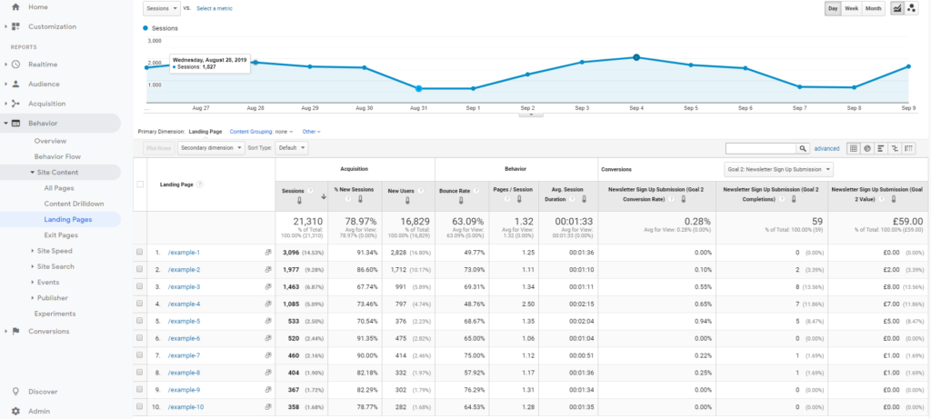
You’ll find the ‘Bounce Rate’ within this report (which, if you followed the guide in the last part of this series, will now be measured accurately) and ‘Conversion Rate’. There’s often an inverse correlation between these two metrics, since the more users that bounce on a page, the fewer there are to convert eventually.
This isn’t always the case, however. Your highest bounced landing page could also be your highest converting; it all depends on where a user is within the funnel and the purpose of the content itself.
Proving the worth of your content through analysis
If you followed the advice in the last article, then you should have a measurement plan in place for your content and begun tracking meaningful micro and macro conversions on your site.
Segmenting users who have performed specific actions reveals the content they engaged with during a session. For instance, if we wanted to understand what content was driving newsletter sign-ups on the website, we can create a session-level segment as so:
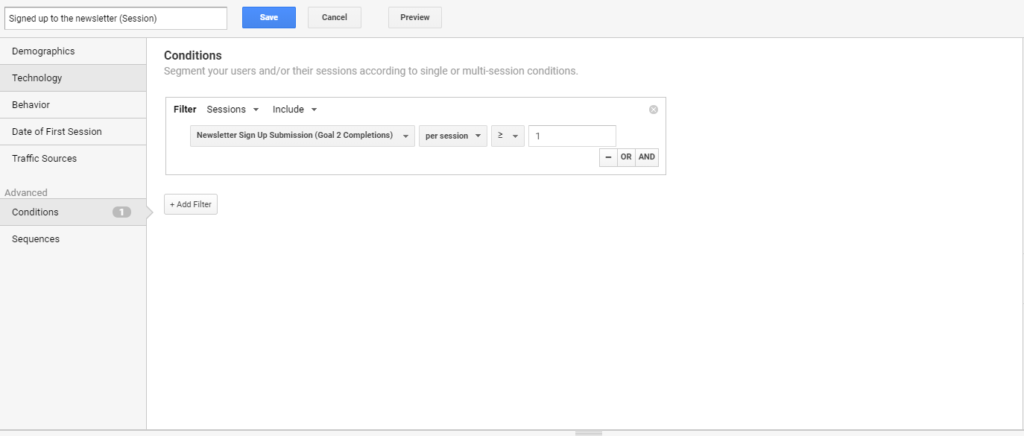
By applying this segment to the ‘All Pages’ report, we can see which pages users viewed before they converted. While these pages weren’t necessarily the pages that converted the user, they did help to push them towards converting.
| Page Title | Pageviews | Assisted Pageviews | Assisted Rate |
|---|---|---|---|
| Luke Skywalker | 7017 | 591 | 8.42% |
| Star Wars: Episode V The Empire Strikes Back | 8218 | 774 | 9.42% |
| The Force | 7326 | 159 | 2.17% |
| R1-J5 | 9058 | 671 | 7.41% |
| Bounty hunter | 8189 | 697 | 8.51% |
| Garven Dreis | 2295 | 124 | 5.40% |
| Invasion of Naboo | 5025 | 564 | 11.22% |
If we add these ‘Pageviews’ with the ‘Assisted Pageviews’ metric, we can start to create a calculated metric for the percentage of traffic to a page that went on to convert. By pulling out pages that had lots of traffic but low conversions, we can start to analyse why these pages haven’t been working as hard as they should be.
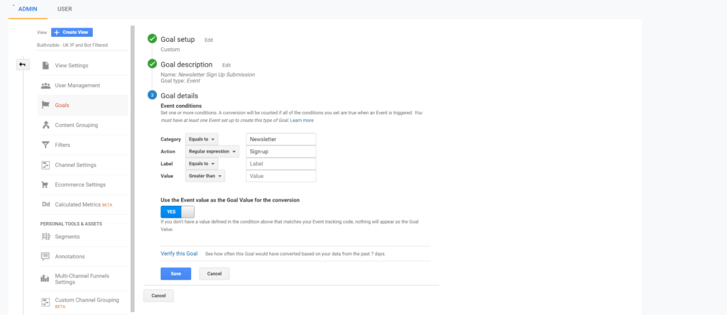
You can also set up a value for performing these actions. For our newsletter sign-ups, we could calculate the cost of acquiring a newsletter sign-up via a paid channel and use this as the value. This can be set up within the goal configuration itself by using the ‘Event Value’.
Using this data, you can start to calculate ROI on the content you’re producing. Our Head of Content, Rebecca Brown, has written a fantastic article about how you can use your analytics to justify more investment into content.
Presenting data back to the wider team
Google Analytics can be difficult to understand and hard to navigate if a user isn’t familiar with the tool. Extracting even the simplest data can become a frustrating task, especially if we add custom set-ups into the mix.
One of the best – if not the best – format to present data back to the wider business in the most presentable, user-friendly way possible is through Data Studio. This data visualisation tool enables users to get a full view of the data in a readable, easy-to-use interactive dashboard.
Data Studio has a great community; blog posts are written daily on how to improve the way you’re visualising data and there’s even a Data Studio for all these resources created by Lee Hurst. It’s free to use and can be trialled before moving onto more expensive solutions in the market (if required).
The types of analysis mentioned above can all be set up within Data Studio, allowing you to track changes you’ve made over time easily. Opening the data access up to different members of your team and your client’s team will gather insights from a host of professional backgrounds and their unique perspectives helping to improve content in ways that aren’t just from an analytics viewpoint.
Unless you’re a one-person team, the first piece of advice when building out a dashboard is to map out the target audience for the dashboard. Your target audience is the people who will be viewing, analysing and reporting on the data to improve content across the site.
It’s essential to work with these stakeholders to gather their requirements for the dashboard as these will differ depending on the team:
- The marketing team might only be interested in what types of content are driving users to the site.
- The content team will be more focused on how engaged users have been with their content.
- The product team will likely want to know how which features the user is interacting with.
Once you’ve gathered the varying requirements of the business, it’s time to start building the dashboard. Start playing around with different ways of visualising the data; the beauty of Data Studio is the flexibility it provides. It’s important to present the data in a way that everyone can understand, which can then be combined with their own experience and skillsets to produce insights.
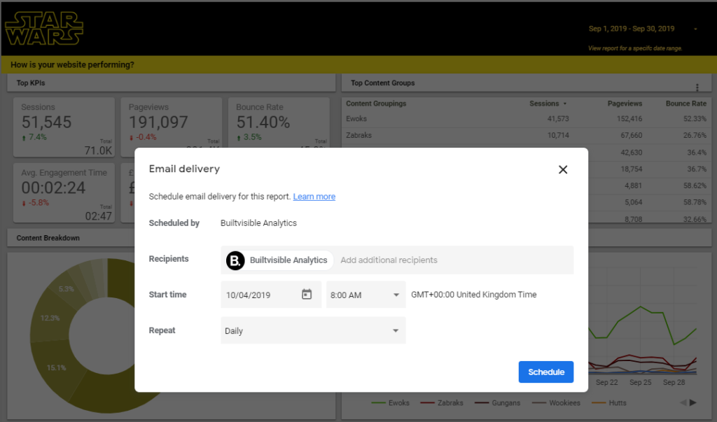
Sending a report across the business is a great way to ensure that data is always at the forefront of decision making. You can forward the dashboard with ‘Email Delivery’ or by using ‘Custom Report’ in Google Analytics and scheduling this to be sent to the relevant stakeholders.
Going forward
Content performance needs to be tailored to the goals of your business, whether that’s creating content to increase brand awareness or content that directly pushes a user to make a purchase. Unless you’re tracking these interactions, there’s no way to determine how much impact your content is having.
Understanding how users are interacting with your content and the impact this has on your overall website is the best way to start building out a data-driven content strategy and justify spending on content within your organisation.
When you’re creating new content for your site, you should be referring back to your measurement plan, updating where necessary and adding new tracking as your business grows and develops.
Chittaranjan Pati
The article is very interesting and effective, really explains everything in detail.Thanks you and good luck .