
Best practice checklist
SEO considerations for mobile
Key considerations for your mobile web design
SEO considerations for mobile
Page speed
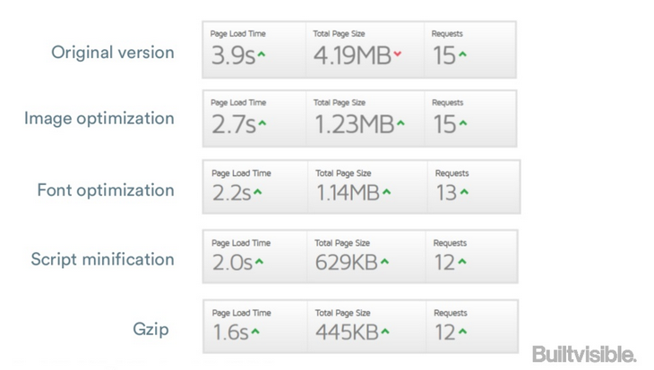
Page speed became a ranking factor for Google back in April 2010 and nowadays everyone understands the importance of improving the speed of a website for search engines and user experience – especially on mobile.
Replacing Click Events with Touch Events, image optimisation techniques and other actions to improve how page’s resources are loaded on mobile – such us mobile-optimised caching or file compression – are some of the actions that can significantly help you improve your website’s page load speed. Remember to monitor your page speed frequently with Google Page Speed Insights and third-party tools like GTmetrix to discover and address any potential issues that might be slowing down your pages.
Site speed for content marketers – view full presentation on Slideshare
Code semantics
Structured data for mobile with Schema.org is another way of enriching your content and make it stand out on search results (rich snippets look even more prominent on mobile devices, due to the limited screen space). Events microdata (which allows users to easily discover and attend your event) and Software Application mark-up (to display your app details in Google search results) are two of the most common forms of structured data for mobile.
Avoid interstitials
Interstitials and overlays that partially – or completely – cover the real content of the page the user is visiting, negatively impact the user’s experience on both desktop and mobile; however, due to the limited display space, this can be even more frustrating when browsing from mobile devices. As Google explain on their Webmaster’s Mobile Guide, you can avoid these by using a simple banner to promote and link to your app inline with the page’s content or by implementing app indexing if you have an Android app.
Optimise titles and meta descriptions
Mobile browser displays are smaller than their desktop counterparts, meaning more limited space for titles, URLs and meta descriptions on mobile SERPs. Google is still experimenting with title tag length on mobile, and so there is no hard-and-fast rule on length. However, by sticking to under 60 characters for titles and under 155 characters for meta descriptions, you can expect at least 90% of them to display properly without being truncated.
Accessibility
Googlebot needs access to many resources (such as scripts, CSS, and image files) on your page in order to render and index the content optimally. This can affect the page’s ranking in Google search and therefore, you need to make sure that your robots.txt file is not preventing Google-Mobile user-agent from accessing these files and that it can see pages like an average user. Use the “Fetch as Google” feature (which simulates a crawl and render execution as done in Google’s normal crawling and rendering process) and check the blocked resources report, which will show you the resources used by your site that are blocked to Googlebot.

Key considerations for your mobile web design
There are many aspects you need to consider at the outset of your mobile site design project if you want to ensure a good user experience. Avoiding Adobe Flash, optimised spacing between page elements or building a responsive navigation menu are only some of them. However, as there are many articles out there about design patterns and guidelines for mobile development, we have only included factors which can have a bigger impact on the SEO performance of your site.
Meta viewport element
The meta name=”viewport” tag gives control over the page’s width and scaling on different devices and it’s placed in the html page’s head, as shown below:
<meta name="viewport" content="width=device-width">The width property controls the size of the viewport. It can be set to a specific number of pixels, like width=600, or to the special value device-width which is the width of the screen in CSS pixels at a scale of 100%.
For more information on using the meta viewport element, click here.
Fluid images
Unless you specify the opposite, standard images remain the same size and orientation at all configurations of the viewport, being cropped when becoming too large for their container. Fluid images, however, adapt to the container they are in, which scales down or up in relation to the device screen.
There are two approaches to creating fluid images:
- You can make the image to scale along with the browser window as it narrows by setting the max-width of the image at 100%:
<img style="max-width: 100%; height: auto;" src="picture-example.jpg" alt="London-landscape">
- If you want the image to scale with the text size instead, you will have to set the width of the image as a percentage of the overall page’s width:
<img style="float: right; width: 41.66%; margin-left: 2rem;" src="picture-example.jpg" alt="London-landscape">Responsive videos
When building responsive websites, you will want to scale videos as well as you would scale an image. This can be achieved by creating intrinsic ratios for video, a technique which allows browsers to determine video dimensions based on the width of their containing block, whilst maintaining its original aspect ratio. This approach avoids static sizing that can distort the image or display black bars around the video (also called letterboxing).
Break points
Breakpoints are browser widths at which your site’s content will respond to provide users with the best possible layout. Whereas you can use standard breakpoints when designing responsive pages, it is recommended creating these based on content – never on specific devices – to ensure a better user experience. It is best practices to design for your smallest viewport first: design the content to fit on a small screen size first and then expand the screen until a breakpoint becomes necessary.
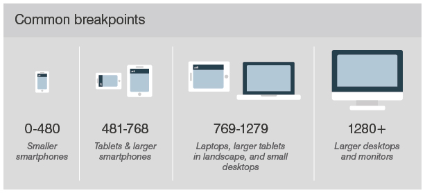
Remember also to create breakpoints for devices when they are in both landscape and portrait orientation. You can read this article for more information on creating custom breakpoints.
CSS media queries
Media queries are a CSS declaration that allow you to load different CSS properties based on screen dimensions (width). They are an effective and simple way to rearrange a page’s content based on the browser window size.
For more information about media queries in responsive web design, click here.
Measure your success
Finally, in order to understand how your content is performing, you should track the performance of your pages. By monitoring messages pertaining to mobile usability on Google Search Console, you will discover specific issues that need to be addressed; and by testing your pages with the Mobile-Friendly Test tool, you will be able to find out whether your site is compatible for mobile users at a page level. Comparing average position across mobile and desktop for your top traffic driving keywords can also help you identify any potential issues your site might be having with mobile devices.
Marcin Kordowski
Thanks for Interesting Articles. I would like to add some points which are also important:
Minify CSS, JavaScript, and HTML
Reduce redirects
Leverage browser caching
Best,
Marcin Kordowski,
IADMS Bangalore
Nice post. This is a great checklist and I always do this checklist before working on any projects. Thanks for explaining it in detailed manner. Its really necessary. Thanks for sharing!