317% increase in lead volume for a B2B website
Website redesign and new templates improve sessions by +89% YoY
Overdrive Digital are a marketing agency specialising in helping marketing and ecommerce teams prove the value of paid social and PPC. With deep platform knowledge and specialist teams, results and relationships are core to everything they do.
The challenge
Overdrive Digital approached us to modernise their website and ensure it reflected the ever-expanding agency.
They wanted a new sleek design, aimed at showcasing their products and their brilliant team of professionals while remaining on brand and in line with their values.
What’s more, their existing website was underperforming on all important B2B metrics, including volume of leads generated and conversion rate to enquiry.
The solution
Builtvisible were engaged to overhaul the website design, accommodating end users, the brand, client and third party developers at every stage of the process.
Our role was to improve the look and feel of the website while also improving user experience and ultimately making the designs more performant. Our scope was to create mobile and desktop template designs for core commercial templates, such as the services and case study pages. We were also engaged to create individual page designs for major areas of the website such as the homepage; these were especially important to ensure a smooth transition to their development team, minimising friction in the website build process and driving efficient delivery of the overall project.
As a first step, we threw ourselves into understanding the brand, immersing ourselves in as much information as possible about Overdrive Digital. We believe it is important to understand what key client stakeholders want to achieve with their website project before any time is spent in the design process. To achieve this we ran a series of onboarding interviews with the client to help us understand their goals and KPIs, their brand, existing design system, style guide and tone of voice. This helped us establish a framework for the brand as well as creative direction on how to translate their objectives visually on the new website.
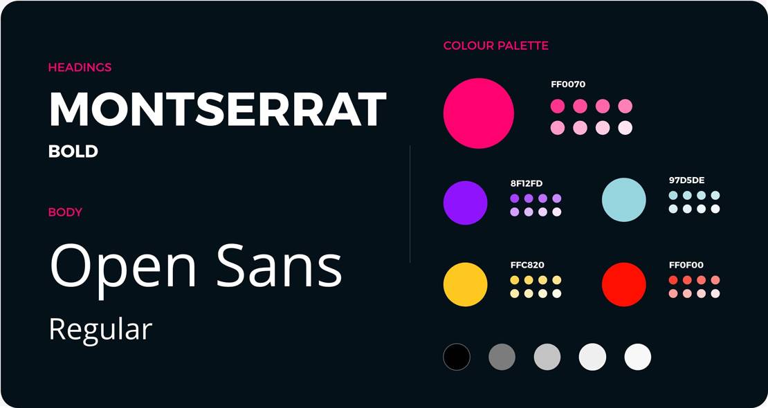
Before proceeding with the layout design, we spent some time defining the website’s building blocks, such as the primary and secondary colours and fonts. We wanted to make sure that these new styles were in line with Overdrive Digital’s brand guidelines, so we experimented with different combinations of tones and colours until we found the right palette that was bright and accessible, reflecting their energetic brand. We completed the initial phase by coupling the new palette with the new font styles to use across the website.
In the second phase, we collaborated with the client on the creation of a detailed site map to establish the new website architecture, all category and individual page requirements as well as informing the project plan and Gantt chart. When it comes to building a site from scratch, we believe it’s important to define its structure early in the process. Firstly, from a design perspective, we needed to understand how Overdrive Digital’s pages were connected, how they would need to work together to improve the customer user journey through the website, and how we could surface the all-important enquiry forms with the website architecture.
Secondly, it was important for project logistics. Our site map confirmed the volume of templates and pages which required design support, as well as informed the Overdrive content team. They could then identify which pages should be prioritised for copywriting, working closely with our designers and project manager. We also made sure the architecture was aligned with SEO requirements before proceeding to avoid having to make any revisions later in the process.
Once we knew a priority order for the templates and page designs we updated our project plan to be broken into six separate phases, starting with key templates first and collaborating with the client on content requirements in a waterfall style process.
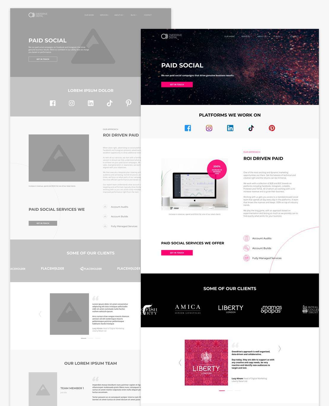
For each design, we created a wireframe that defined the style of the modules featured throughout the website. Once we received the sign off from the client, we used those wireframes as the foundation for the page design by adding the content, text styles and palette colours.
We tackled the Services template first; this included the majority of design modules we would use throughout the website. We also made sure we proactively communicated with the client at every stage of production. This was to ensure we were fully aligned throughout the design process, and to minimise delays at any later stages of production.
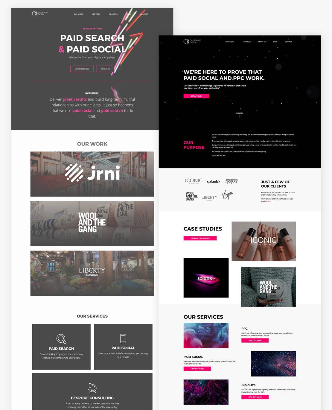
Once the fundamental building blocks of the design modules were approved, we moved onto tricker pages with more complex navigational elements, such as the blog and case study content hubs. We finished our creative work with the homepage, leaving the most important page to last to allow us to gain as much client feedback throughout the process as possible before starting on the digital “shop front” to the brand.
Throughout the creative process, the Overdrive Digital team were key allies. Our close collaboration proved fruitful in the fine-tuning of the web layout and the page elements’ behaviour. Both teams worked hard to create a unique user experience, such as by introducing subtle motions that made browsing the pages more curious and interesting, while inviting the user to explore and interact with the site.
Finally, the most delicate part of the project was the design handover. It was crucial for us to be proactive with client teams and educate third party suppliers on requirements to ensure our designs were translated into the live website environment as intended.
Our handover process provided the developers with user friendly files containing all the necessary info for production. For this project, we created a detailed guide including page prototypes, downloadable assets and CSS-ready modules. Given the importance of page transitions, we also provided video samples showing the elements’ interaction and the speed with which they had to move on the screen.
The handover document proved to be useful not only for developers but also for the client, who was able to use it as a reference to track production progress.
The results
Overdrive Digital launched their new website in Q4 2020. They were able to clearly see the impact of our design work on lead generation performance by comparing site metrics year on year.
Reviewing H1 YoY between 2020 and 2021, engagement metrics remained steady, sessions increased +89% YoY and the number of enquiries have skyrocketed above and beyond other KPIs!
Following the design and UX refresh, Overdrive Digital now see a steady stream of leads generated by the website and overall enquiries have increased YoY by a huge 317%.
The client is overjoyed with their new highly performant website which remains on-brand for the agency, and is thrilled with the lead generation results.

