Story
Find a story that’s already gained a lot of press in a short amount of time. Look for mentions of ‘annual report’, ‘new figures’, etc. This suggests an opportunity exists for the findings to be updated soon. What made the report get so much coverage? Break it down and get your hook.
Research
Where did the figures come from before? Find that dataset and check if it will be updated. Pick up the phone and ask!
New angle
If you had the updated dataset, what would you do with it that hasn’t been done before? Why would a journalist want to use it?
Preparation
Once you know when the figures will be updated, work backwards from that date. Collect all the published articles that reported on the story before, list the sites, journalist’s names, etc. and that’s your initial outreach list.
Here’s how I did it…
First, some context. An insurance client wanted to focus the next campaign on unoccupied property insurance, a product of theirs.
With all the talk about a housing crisis and how we need to build homes, I was curious: how many properties are already built but sitting empty? Wouldn’t it be interesting to see how each London borough has changed over the years?
I thought so.
My idea was simple: look at the number of properties sitting empty in London and visualise the change in each borough over the last 10 years.
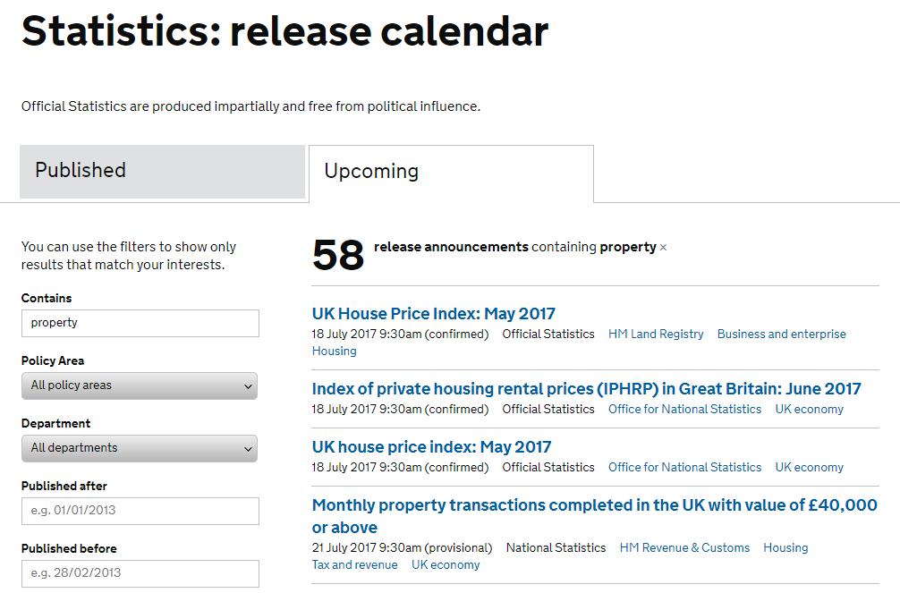
Future ideas: gov.uk statistics calendar
If you’re struggling for story ideas, check out Gov.uk statistics calendar for upcoming data they have scheduled to publish.
You can find all sorts of interesting, soon to be released data, such as baby names, travel trends, property insights, etc. They have an easy to use search bar to help you find what you’re looking for and tonnes of filters to help you sift through the data.
Gov.uk’s website gave me all the research I needed via a table reporting the number of long-term (where a property is vacant for more than 6 months) properties in England. The table drilled down to the exact number lying vacant in a London borough and gave an overall figure for England over the last 10 years!
Why I thought it would work
- When I first thought about this idea, there were a lot of articles online talking about the new London Mayor’s commitment to reduce the number of empty properties in London (great for building a quick, targeted outreach list)
- Research would be easy as it’s all there on the government’s site
- It’s interesting, visual, and people will no doubt have a strong opinion about it
The story
Knowing gov.uk would release the new figures in April, I phoned them to find out the release date for the new dataset and then worked back from there with the following activities:
- Aligning our internal resources so the designs could be completed that morning
- Securing commentary from the client and had an approved press release ready to go
- Updating my outreach list based on previous years’ reporting of empty property figures
This is the London property heat map our designer produced as a gif by overlaying each year’s results onto a single static map. This gave the impression of animation as it moves through the years, yet is also an incredibly lightweight and simple file to produce:
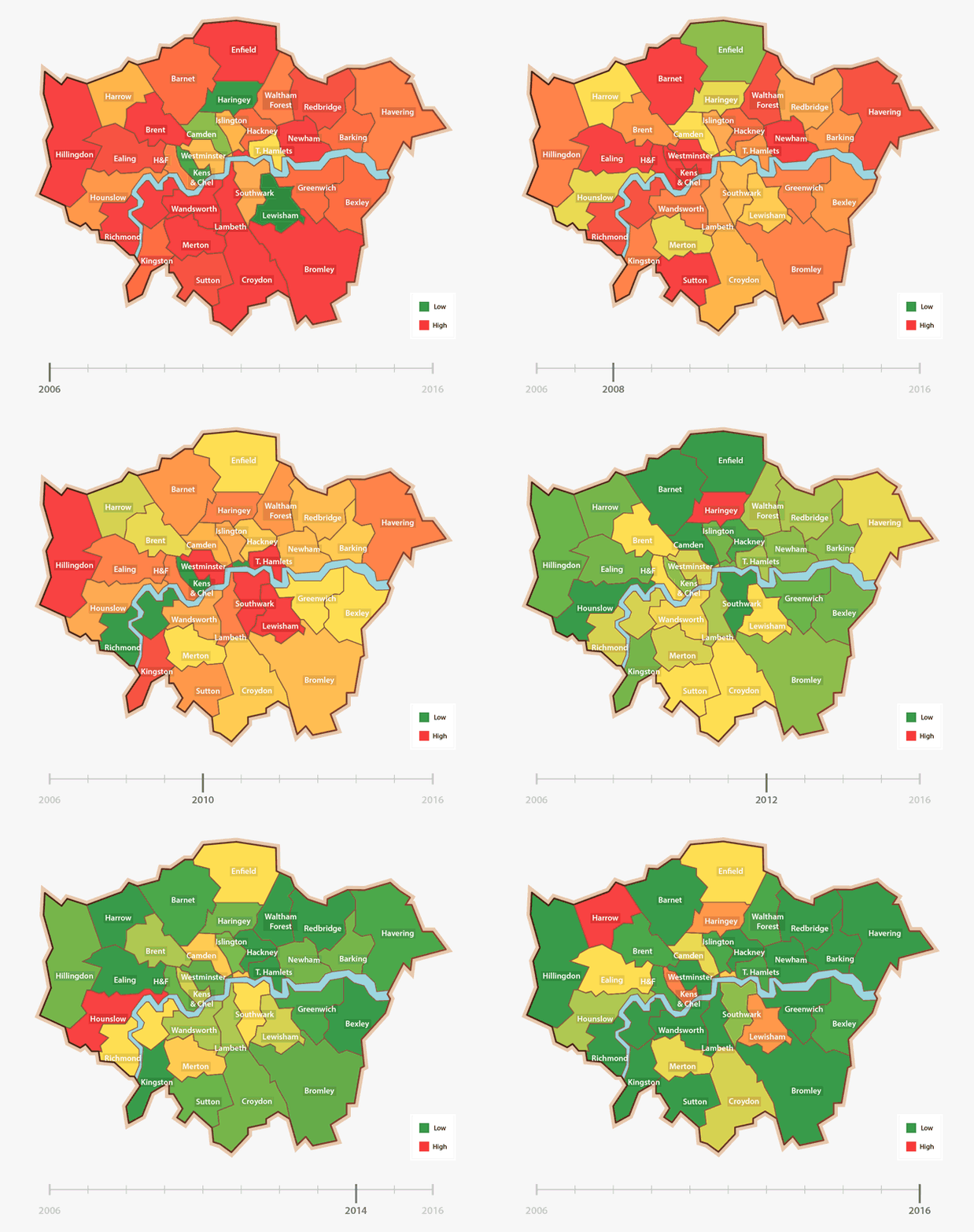
Heat map of empty properties in London 2006 – 2016
Here are two of the big pieces of coverage gained from this simple idea:
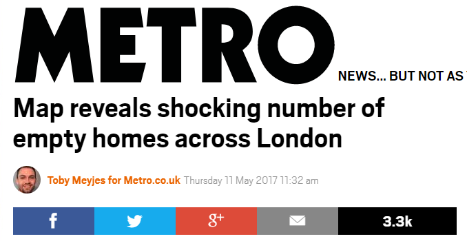
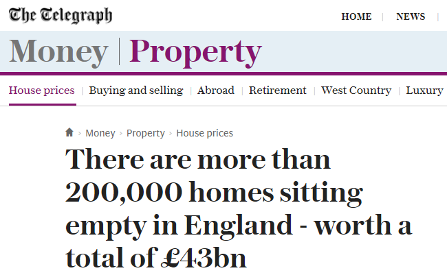
I hope this gives you a few ideas on your own outreach endeavours!

Jesse
Thanks for the article. I am going to reach out to authors and see what I can learn. I am going to implement what I have learned in this article for my future outreach.
Alex
At least you are proposing that original content is developed from the initial piece – and that there is a “value add”. The trouble is, the majority are doing it in a way that devalues the web. We now have multiple online businesses that are literally doing nothing other than reblogging the most-shared of other people’s content, in very many cases with a worse quality article than the original (or stealing the article), jam packing the pages with ads and calling themselves a media channel.