Targeted UX tweaks yield fast results
Enquiry form redesign boosts conversions by 20%
With a broad, specialist insurance product offering spread across more than 100 different pages, driving overarching, site-wide revenue improvements for Towergate Insurance is no small order.
That’s why we always aim to implement changes like these that equally benefit the company's whole portfolio of products.
The challenge
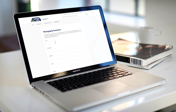
For Towergate Insurance, product-specific enquiry forms constitute a core part of the conversion journey, allowing buyers of niche insurance products a direct line to the right specialist product team. Though ongoing SEO work had boosted the search visibility of these pages, they still weren’t performing as best they could when it came to conversions.
As part of Builtvisible’s regular reporting activity, we discovered users were frequently dropping off during the process, taking their business with them. With the client’s internal teams unable to act on this information due to heavy internal workloads and lengthy queues, this was the perfect opportunity to hand over to our integrated design and development team to get to the root of the problem.
The solution
Our designers started with thorough research into how Towergate’s competitors and other notable brands approached their enquiry forms. This armed them with a thorough understanding of the competitive landscape and provided key insights into the standards users expect within the industry. From that investigatory work, two core issues arose:
- Dated design was failing to create the sense of trust users expect when seeking out an insurance provider
- Unclear and restrictive data validation was causing users to give up on the form after it failed
With an understanding of these issues established, the route to solving them was clear. Refreshing the look and feel of the pages brought them back in-line with more modern standards, ensuring that users can see Towergate as a brand they can trust.
Then, reducing the number of mandatory fields reduced the risk of overwhelming users, while moving to a method of live data validation meant that any errors they made during the process could be immediately spotted and fixed before clicking the submit button.
Finally, our development team provided modular front-end code for the new forms, meaning that Towergate could easily deploy them across its many insurance products, customising them as needed with minimal need for repetition of work.

Towergate Case Study
Download PDFThe results
Results from initial testing immediately confirmed that we were on the right track. Year-on-year comparisons for the first month on a pilot page pointed to a 24.6% surge in leads and a 20.4% increase to conversion rate.
Rolling out the changes more widely, this ability to simultaneously boost conversions across more than 100 key pages paid dividends. A year-on-year comparison showed that the redesign had contributed to an overall 24.3% increase in leads generated across the site over the first half of the year.
The results here speak volumes about the benefits of working across departments. Without our integrated design and development team, we wouldn’t have had the multi-disciplinary insights needed to make such a big impact on our client’s commercial performance.

