+312% share of search for G4S’s Cash Solutions offering
SEO, content and creative unite to breathe new life into core product offering
G4S Cash Solutions is the UK's leading provider of integrated cash management solutions.
They arrange for essential services to support businesses in processing cash, card and digital payments, efficiently and safely.
The challenge
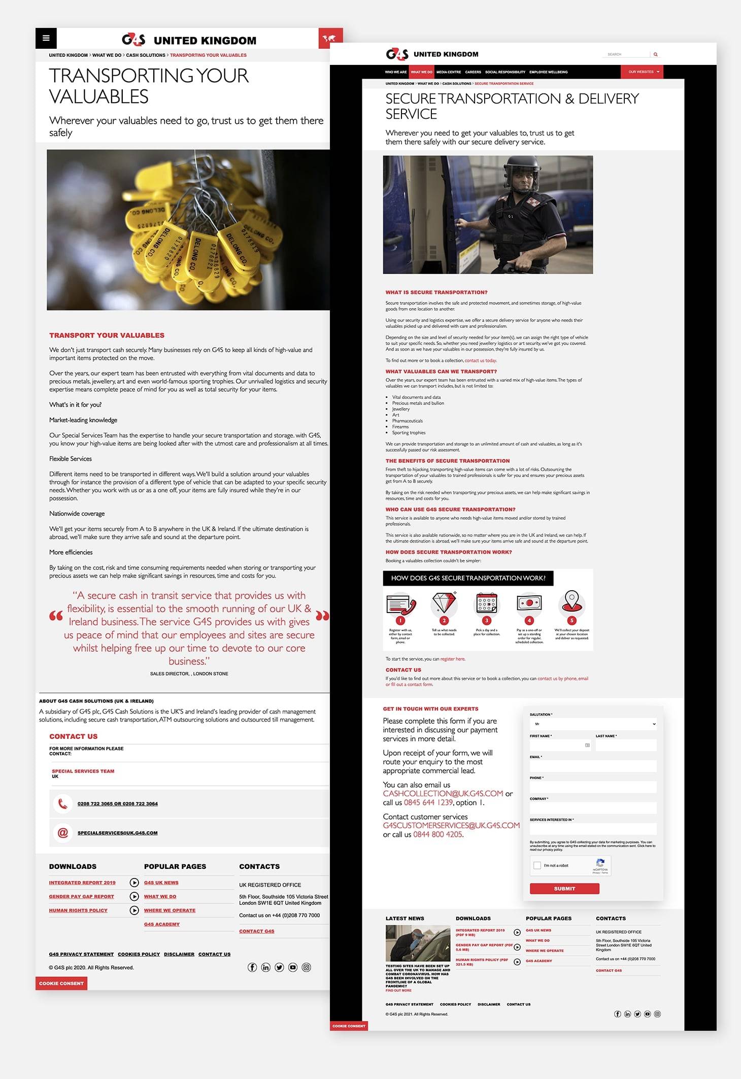
G4S approached us to overhaul the web presence of their Cash Solutions arm of their business. In need of a refresh and generally under-optimised, the existing set-up did not do justice to the array of future-facing solutions they had to offer businesses trading both on- and offline.
We took a three pronged approach:
- Revitalise the minimal Cash Solutions website offering by refreshing and expanding existing content with improved targeting and engaging assets whilst retiring underperforming content
- Support the launch of the G4S Pay product, helping create a robust understanding of the new sector and mapping this to fresh new pages
- Sunsetting the old Cash Collections microsite and incorporating any remaining value into the central global site
Working closely with the G4S team, these three workstreams combined to create a new-look Cash and Pay hub that better represented the brand’s offering and positioned them perfectly to support the significant increasing demand for online payment processing.
The solution
Revitalising Cash Solutions
Our work began with a thorough analysis of the search landscape, key competitors and current performance. Operating in the financial space, a high bar had been set by the competition with top ranking sites offering extensive, high-quality content boosted by rich media assets.
By comparison, G4S’s existing pages were sorely lacking and performance reflected this with organic traffic weighted heavily towards branded queries and existing customer support only.
Working in tandem, our SEO and content experts set about defining an action plan to retire unnecessary pages and build out existing ones to better reflect user demand. Working within pre-existing Sitecore design systems, we revamped the page templates themselves, expanding the structure to offer more opportunities to target key search terms and using graphics to bring processes to life.

Launching G4S Pay
Starting from scratch, we needed to build a comprehensive view of the landscape to help G4S understand their biggest opportunities to compete in the card payment space. Defining the core focus areas, we created the optimum site structure to support a host of compelling new pages we created on bespoke page templates to help the brand hit the ground running in this competitive sector.
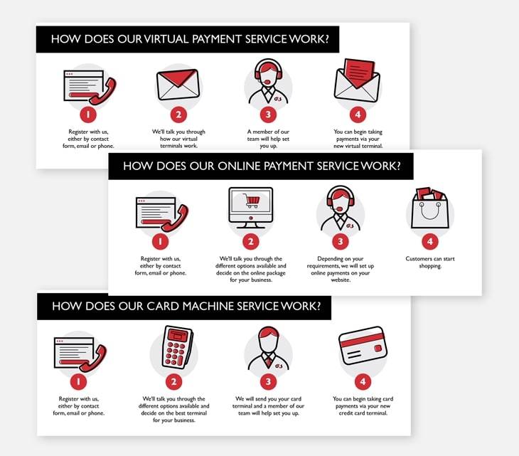
Once again our creative team got to work on a series of graphics to enrich key landing pages and simplify complex topics with ease.

Retiring G4S cash collections
Lastly we supported the sunsetting of the old cash solutions domain, redirecting old pages to their closest partner on the new-look hub. The team took insights from the best performing pages on the old domain, building these lessons into the new product offering on the global site.
G4S Case Study
Download PDFThe results
Within a month of launch keyword rankings for 70 of our 95 focus keywords had improved, with 31 terms entering page 1 for the first time. Of the two highest volume priority keywords we monitored, one leapt 79 positions onto page one, and the other moved from averaging position 23 into the coveted position 1 spot.
Without any advertising, on or offline, our pages for the Pay offering have attracted a wealth of new visitors in their first 6 weeks of being live. The revitalised hub as a whole has grown its share of search in the cash solutions space from just 6% to 26%, a massive 312% increase, cementing G4S’s position in a highly competitive niche.


